Summer Gradient Palettes: Bright Backgrounds for Vacation Content
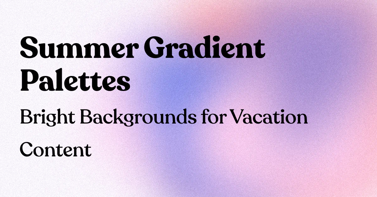
Summer Gradient Palettes: Bright Backgrounds for Vacation Content
Let's be honest—your vacation photos are probably gorgeous, but they're getting lost in the endless scroll of identical beach shots and sunset selfies. Don't take it personally; it's not you, it's your backgrounds. While everyone else is slapping basic filters on their content, you could be using something that actually makes people stop mid-scroll: killer gradient backgrounds.
Summer 2025 is serving up some seriously fresh color trends, and if you're not jumping on this gradient train, you're basically leaving engagement on the table. But don't worry—I'm here to help you create vacation content that doesn't just blend into the digital wallpaper.
Why Summer Gradients Are Your Secret Weapon
Here's the thing: vacation mode doesn't always include screen time which can lead to lower engagement rates. People are distracted by actual sunshine (shocking, I know), which means your content needs to work twice as hard to grab attention.
A well-crafted gradient background doesn't just complement your vacation photos—it transforms them into thumb-stopping content that screams "look at me!" in the best possible way. Think of gradients as the difference between wearing a wrinkled t-shirt to a beach bar versus showing up in that perfect linen shirt that somehow makes you look effortlessly cool.
The Summer 2025 Color Trends That Actually Matter
Before we dive into specific palettes, let's talk about what colors are actually trending this summer. The color that dominated the summer of 2024 was undeniably Brat Green, influenced by the pop star Charli XCX's album release, but 2025 is bringing some refreshing changes.
Summer 2024's cobalt has been swapped for the more wearable and familiar boyfriend blue, an easygoing shade that doesn't need much styling. Meanwhile, bright red has made its way into every part of the summer wardrobe and is translating beautifully to digital backgrounds.
Periwinkle, which runs the gamut from red-toned blue to soft lavender, is majorly trending, and muted orange is having its best year yet, being seen in all the most coveted interiors across the country.
8 Show-Stopping Summer Gradient Palettes
1. Tropical Sunset Vibes
Coral Pink → Mango Orange → Golden Yellow
Perfect for those golden hour beach shots where you want to amplify the natural magic. This palette screams "I'm living my best life" without being obnoxiously loud about it.
2. Ocean Breeze Cool
Soft Periwinkle → Boyfriend Blue → Seafoam Green
This is your go-to for poolside content and coastal adventures. It's calming enough to let your photo be the star while adding that perfect pop of color that makes everything look more professional.
3. Mediterranean Dreams
Lavender → Dusty Rose → Warm Terracotta
Inspired by European summer vibes, this palette works beautifully for architectural shots, café moments, and those "casually chic" travel photos that took 47 attempts to get right.
4. Citrus Burst Energy
Lime Green → Bright Yellow → Tangerine
For when you want your content to practically vibrate with summer energy. Use this for adventure shots, festival content, and anything that needs an instant mood boost.
5. Desert Mirage
Dusty Pink → Muted Orange → Sandy Beige
Perfect for those boho travel moments and desert adventures. This palette adds warmth without overwhelming your content—it's like Instagram's version of a perfect tan.
6. Coastal Morning
Soft Mint → Powder Blue → Warm Cream
This understated palette is perfect for breakfast shots, morning beach walks, and content where you want to look effortlessly put-together. It's the visual equivalent of "I woke up like this" (but better).
7. Electric Paradise
Hot Pink → Electric Blue → Neon Yellow
For those moments when subtle just isn't going to cut it. Pool parties, night markets, and festival content come alive with this bold combination.
8. Botanical Bliss
Sage Green → Soft Yellow → Peachy Pink
This nature-inspired palette works beautifully for garden visits, outdoor dining, and those moments when you want to look like you belong in a lifestyle magazine.
How to Actually Use These Gradients (The Smart Way)
Now, before you go slapping gradients on everything like it's 2001, let's talk strategy. The key to using gradient backgrounds effectively is understanding that they should enhance your content, not compete with it.
For Portrait-Style Content: Use softer, more muted gradients that complement your skin tone and outfit colors. The "Mediterranean Dreams" or "Coastal Morning" palettes work particularly well here.
For Landscape and Adventure Shots: This is where you can go bolder. "Electric Paradise" or "Citrus Burst Energy" can add drama to mountain vistas or urban exploration content.
For Food and Detail Shots: Stick with warmer, more appetizing gradients like "Tropical Sunset Vibes" or "Desert Mirage" that make everything look more delicious and Instagram-worthy.
For Story Templates: The best times to post on social media during summer are weekdays at 9 AM, 11 AM–1 PM, and 5 PM, so having consistent gradient templates ready for your stories can help you post quickly during these peak engagement windows.
Pro Tips for Gradient Success
Match Your Mood: Don't use an "Electric Paradise" gradient for a peaceful yoga session on the beach. Your background should amplify the emotion you're trying to convey, not confuse it.
Consider Your Brand Colors: If you're building a personal brand or business presence, choose gradients that complement your existing color palette. Consistency builds recognition.
Test on Different Devices: What looks amazing on your laptop might look completely different on mobile. Since most people consume social media on their phones, always preview your gradient backgrounds on a mobile device first.
Don't Overdo It: Not every post needs a gradient background. Use them strategically to highlight your best content, not as a crutch for mediocre photos.
The Technical Stuff (That Actually Matters)
Here's where I'll save you some headaches: not all gradient generators are created equal. You want backgrounds that look professional, not like they were created in MS Paint circa 2003.
Look for tools that offer:
- High-resolution output (at least 1080x1080 for Instagram)
- Multiple format options (PNG, JPG, SVG)
- Customizable opacity levels
- Easy color adjustments
- Mobile-friendly interfaces
The goal is to create gradients that look intentional and polished, not like happy accidents. Your vacation content deserves better than amateur-hour backgrounds.
Making It All Work Together
The best vacation content tells a story, and your gradient backgrounds should support that narrative. If you're documenting a week in Greece, consider using variations of the "Mediterranean Dreams" palette throughout your posts to create visual cohesion.
Hosting a competition on your social media is a tried-and-true method used to boost engagement, and summer gradient backgrounds can make your contest posts stand out significantly in participants' feeds.
Remember, the key in any of them is giving your shots your own style by using multiple filters at different levels of opacity. The same principle applies to gradient backgrounds—subtlety often wins over boldness.
Your Summer Content Glow-Up Starts Now
Look, I could keep going about color theory and psychological impact, but here's the bottom line: your vacation content is competing with millions of other posts for attention. A thoughtfully chosen gradient background is like having a secret weapon that makes your content impossible to ignore.
The summer gradient trends I've shared aren't just pretty colors—they're your ticket to creating content that actually gets seen, saved, and shared. And honestly? Your vacation memories deserve backgrounds that are as amazing as the experiences they're showcasing.
So go ahead, pick a palette that speaks to your summer vibe, and watch your engagement rates thank you. Your future self scrolling through these memories will appreciate the extra effort, and your followers will wonder how you suddenly became so good at this whole social media thing.
Ready to create stunning summer gradient backgrounds in seconds? Check out InstantGradient.com for professional-quality gradients that'll make your vacation content impossible to scroll past.