Background Design for Social Media: Boost Engagement & Conversions

You control the first impression. Backgrounds drive measurable lifts in engagement when they create contrast, clear hierarchy, and fast load times. Below are precise rules, a brief case study, and a reusable system to turn background design into predictable performance gains for social media and visual branding for creators.
How Background Design Drives Engagement and Conversions
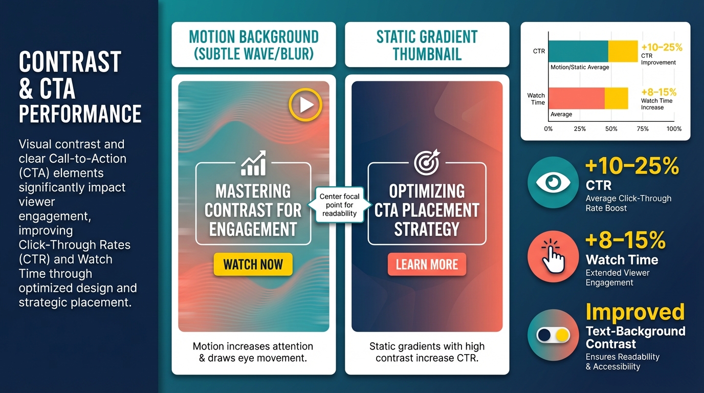
Contrast and focal hierarchy increase click-throughs and watch time by making the call to action and subject readable across devices. Model benchmarks: improving text-background contrast and centering the focal point typically yields 10–25 percent higher CTR and 8–15 percent longer average watch time. Motion backgrounds increase attention for short clips, static gradients increase CTR for thumbnail-driven posts. Why these elements work: contrast reduces visual search time, clear hierarchy directs gaze, rhythm and negative space reduce cognitive load, and motion increases attentional capture.
Case study: A/B test that moved the needle
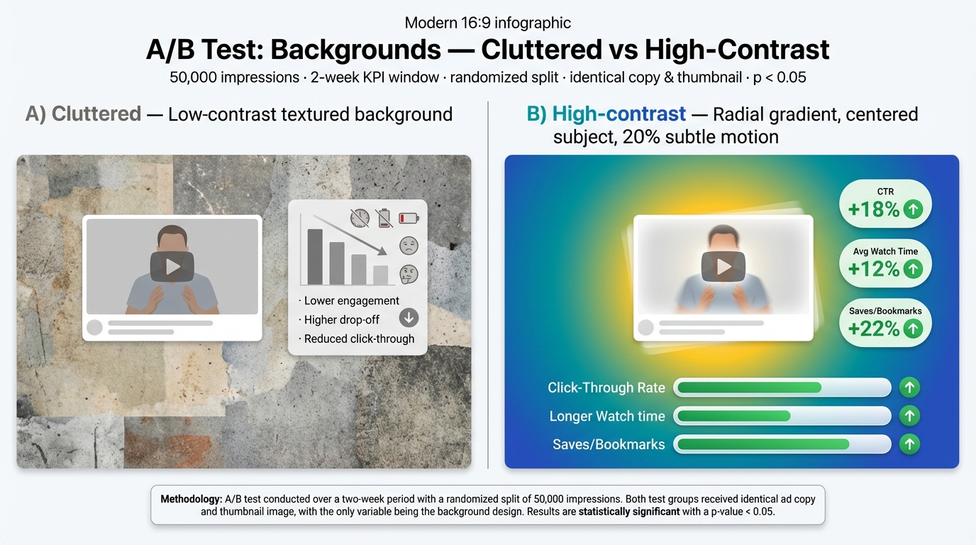
You run a randomized A/B on 50,000 impressions comparing: A) cluttered textured background with low contrast, B) high-contrast radial gradient with centered subject and 20 percent subtle motion. KPI window two weeks. Results: CTR +18 percent, average watch time +12 percent, saves/bookmarks +22 percent. Methodology: identical copy and thumbnail subject, uniform audience split, significance p < 0.05.
A Practical System for Creating Reusable, Accessible Backgrounds
Use tokens: primary/secondary color, texture strength, overlay opacity. Build a template grid with componentized layouts: header band, center focal cell, CTA zone. Keep variant layers so you can swap color tokens without retargeting layout.
Platform-specific rules and export settings
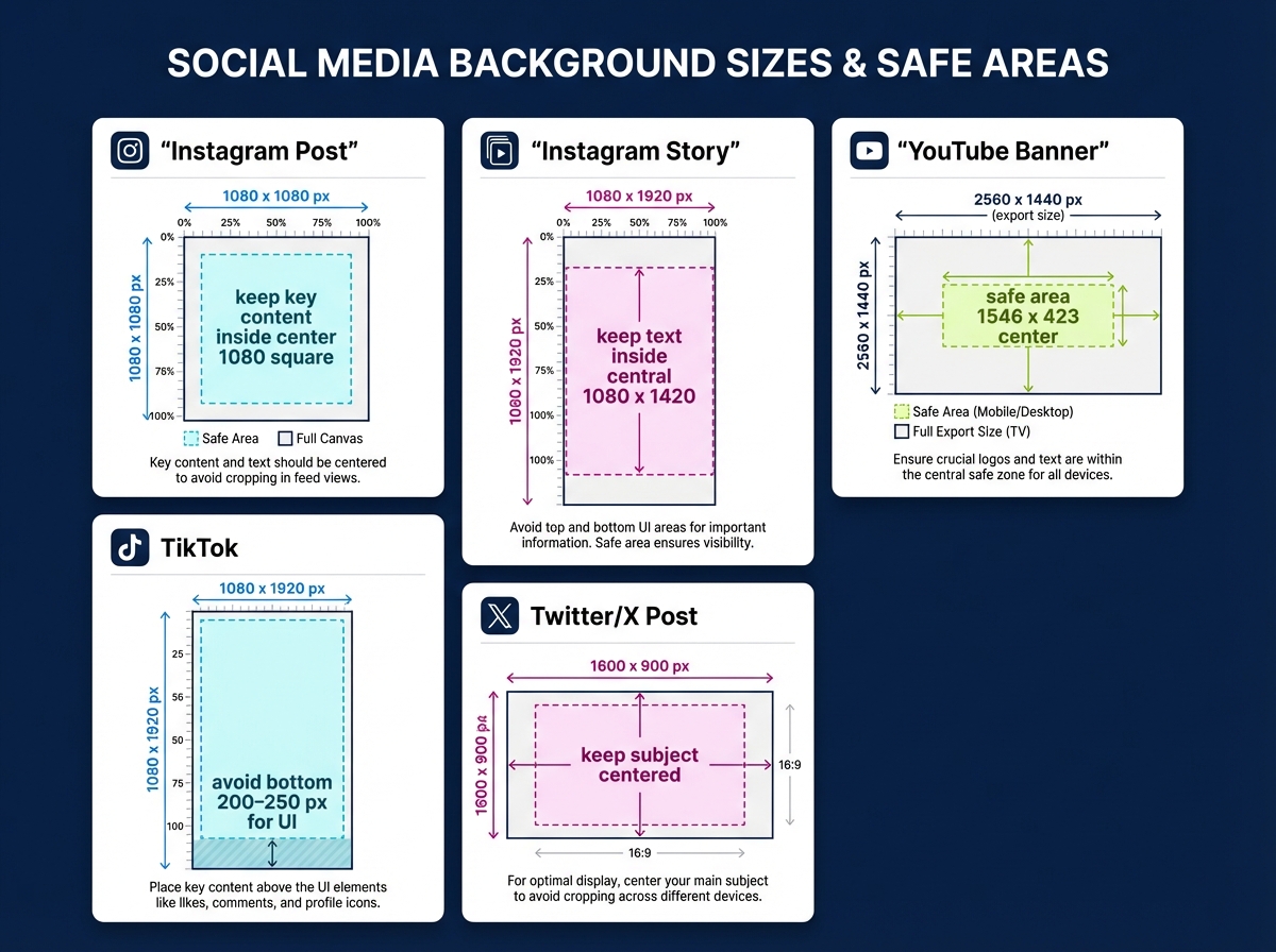
- Instagram post: 1080 x 1080, keep key content inside center 1080 square.
- Instagram story: 1080 x 1920, keep text inside central 1080 x 1420.
- YouTube banner: export 2560 x 1440, safe area 1546 x 423 center.
- TikTok: 1080 x 1920, avoid bottom 200–250 px for UI.
- Twitter/X post: 1600 x 900 image, keep subject centered. Export tips: WebP/AVIF when supported, fallback JPG at 70–80 percent, target < 300 KB for mobile.
Accessibility and performance checklist
- Contrast 4.5:1 for normal text, 3:1 for large text.
- Mobile readable sizes: body ≥16 px, headings ≥20–24 px.
- Alt text, semantic templates, compressed WebP/AVIF, sRGB color profile.
Common pitfalls and fixes
- Clutter: remove nonessential textures; increase negative space.
- Inconsistent branding: enforce tokens.
- Oversized files: downscale and use WebP.
- Ignoring mobile: test within device safe zones.
Conclusion Apply these rules, measure CTR and watch time, iterate with token swaps. A disciplined background design system turns visual branding for creators into repeatable engagement gains.


