Colorful Gradient Backgrounds: Accessible, Performant, Practical
Strategic Use of Colorful Gradient Backgrounds in Visual Projects
Colorful gradient backgrounds can modernize visuals, improve focus, and help thumbnails and hero panels stand out, but they must be chosen and implemented to preserve legibility, accessibility, and performance. Below are concrete rules, palette picks, implementation code, and measurable trade-offs so you can adopt gradients safely in production.
Choosing palettes that guarantee legibility (with WCAG numbers and three sample palettes)
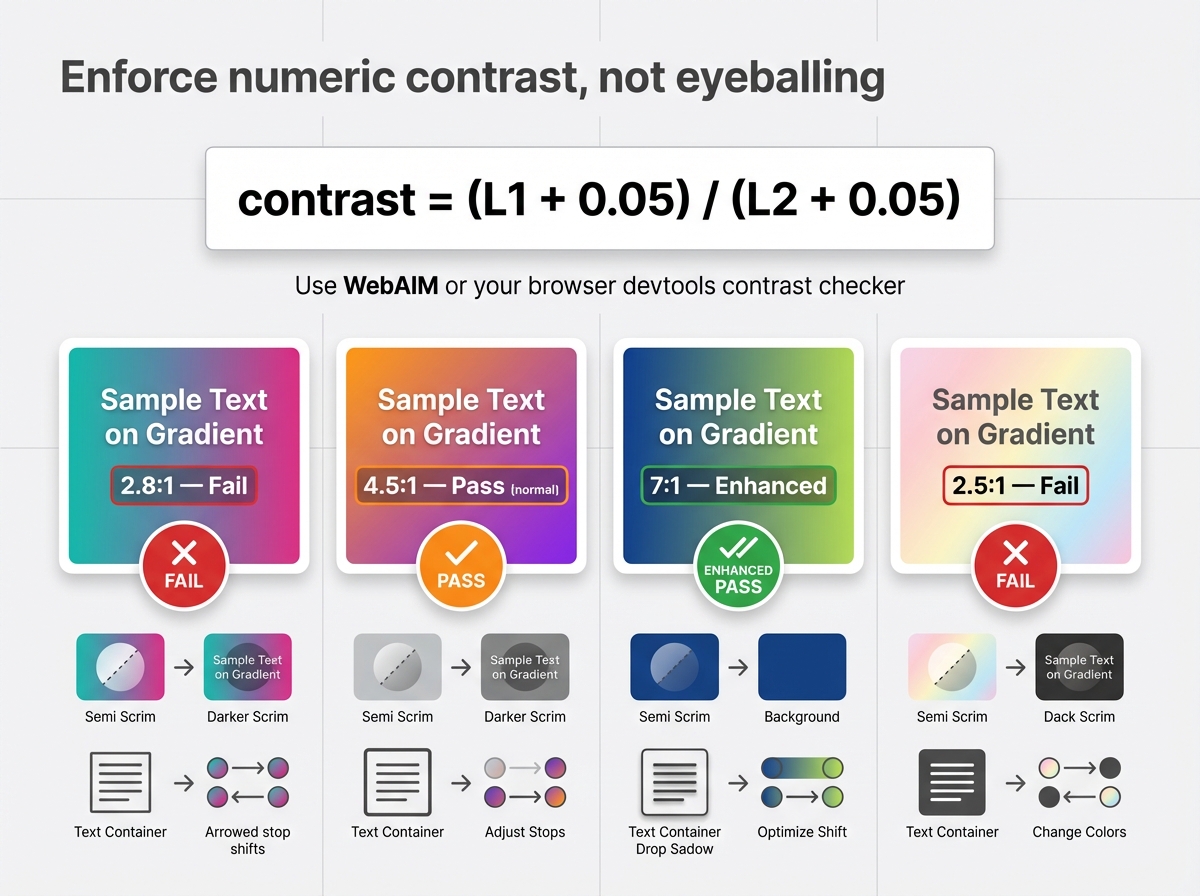
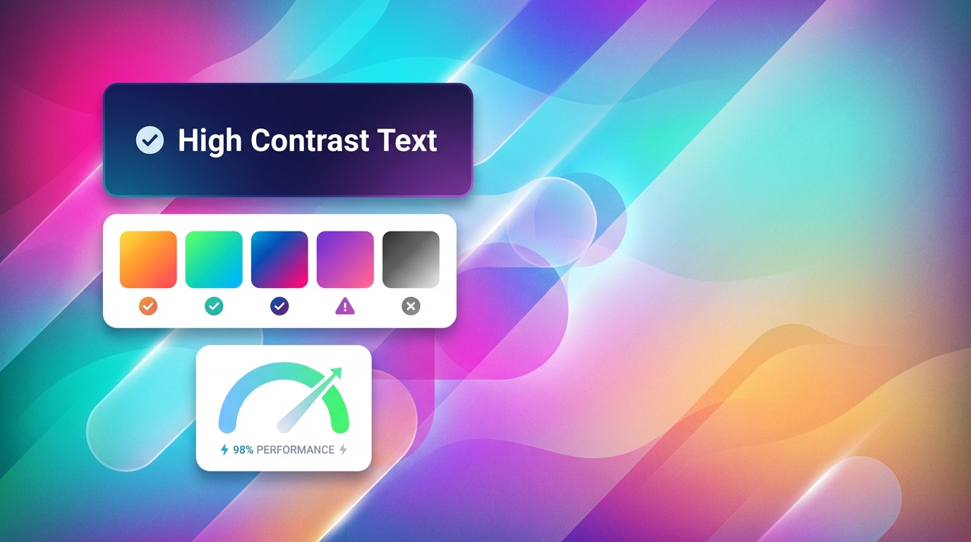
Enforce numeric contrast, not eyeballing. WCAG targets: 4.5:1 for normal text, 3:1 for large text, 7:1 for enhanced contrast. Quick test formula, given two luminances L1 and L2, is contrast = (L1 + 0.05) / (L2 + 0.05). Use WebAIM or your browser devtools contrast checker for rapid checks. If a gradient fails, add a scrim or tighter text container, or shift stops to increase delta.
Three curated palette pairs for light text (use white or #F7F7F7 over these)
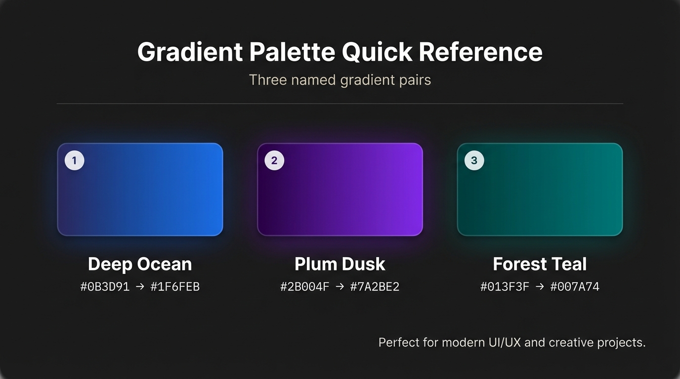
- Deep ocean, moody: #0B3D91 -> #1F6FEB
- Plum dusk: #2B004F -> #7A2BE2
- Forest teal: #013F3F -> #007A74
Three curated palette pairs for dark text (use #111 or #222 over these)
- Soft sunrise: #FFF5E6 -> #FFD08A
- Pastel mint: #E8FFF7 -> #B6F0D6
- Warm sand: #FFF8F0 -> #FFDFC2
For additional inspiration and copyable color stops check ready-made gradient palettes on the Instant Gradient blog, which speeds iteration.
If you need stepwise remediation, see the deep dive on how to fix gradients that fail WCAG for a 5-step checklist and examples.
When to use bold hero gradients versus subtle backgrounds (use cases and short metric examples)
Use bold hero gradients when you need emotional punch - landing pages, app onboarding, thumbnail art, or campaign headers. Use subtle, low-contrast gradients for reading surfaces or areas with dense UI. Example metrics from a controlled switch to hero gradients v3 on a marketing landing page:
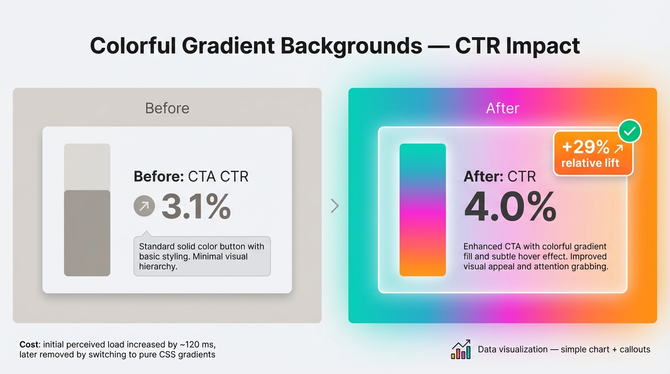
- Before: CTA CTR 3.1 percent
- After: with bold hero gradients and refined focal overlay, CTR 4.0 percent, a 29 percent relative lift
- Cost: initial perceived load increased by ~120 ms, later removed by switching to pure CSS gradients
For guidance on gradient usage patterns and tests, see gradient backgrounds for websites — design & tests.
Translating SwiftGlow and hero-gradients-v3 into usable assets
SwiftGlow gradients look like soft radiance, multiple stops, and blurred layered glows. Recreate the aesthetic by combining subtle radial stops, low opacity overlays, and a blurred SVG layer or CSS pseudo-element. For hero-gradients-v3 follow composition rules: pick a dominant angle or focal point, limit palettes to 2-3 hues, use an 8–12 percent black or white overlay to stabilize text contrast, and add a soft vignette for depth.
Technical Production: Implementation, Performance, and Systemization
CSS vs SVG vs raster: exact trade-offs and two compact code examples
Trade-offs
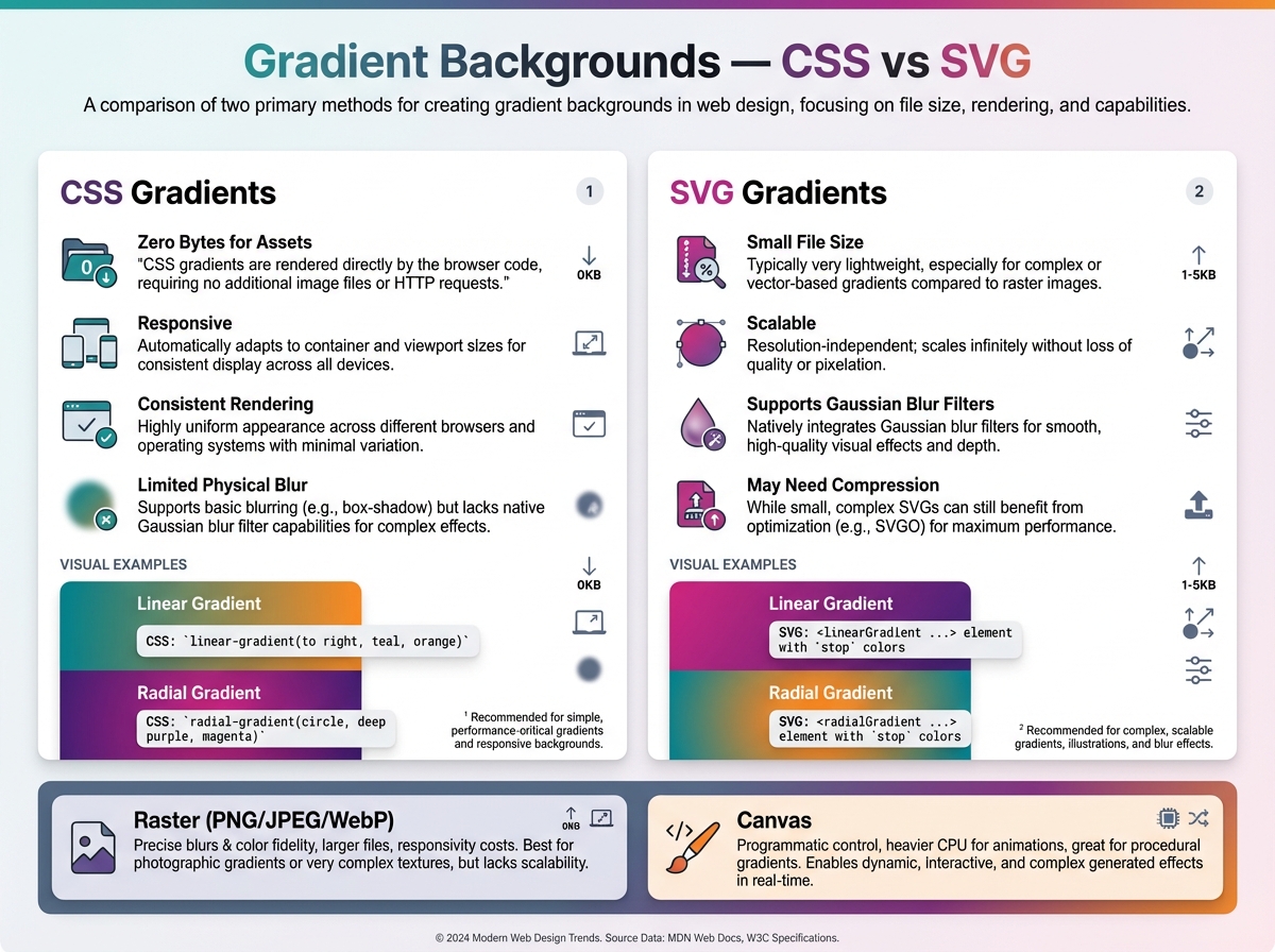
- CSS gradients: zero bytes for assets, responsive, consistent rendering, limited physical blur
- SVG gradients: small file size, scalable, can include Gaussian blur filters, may need compression
- Raster (PNG/JPEG/WebP): precise blurs and color fidelity, larger files, responsivity costs
- Canvas: programmatic control, heavier CPU for animations, useful for complex procedural gradients
If you need organic meshes or exports, use the free mesh gradient generator to produce layered exports for social images and mask-ready SVGs.
Performant linear hero (CSS)
.hero {
  background: linear-gradient(135deg,#1F6FEB 10%,#7A2BE2 70%);
  color: #F7F7F7;
  min-height: 560px;
  background-size: cover;
}
SVG radial blur approach (compact)
<svg viewBox="0 0 800 400" preserveAspectRatio="none">
  <defs>
    <radialGradient id="g" cx="30%" cy="40%">
      <stop offset="0%" stop-color="#7A2BE2" stop-opacity="1"/>
      <stop offset="100%" stop-color="#1F6FEB" stop-opacity="1"/>
    </radialGradient>
    <filter id="f" x="-20%" y="-20%" width="140%" height="140%">
      <feGaussianBlur stdDeviation="40"/>
    </filter>
  </defs>
  <rect width="100%" height="100%" fill="url(#g)" filter="url(#f)"/>
</svg>
Performance tuning and file-size comparisons
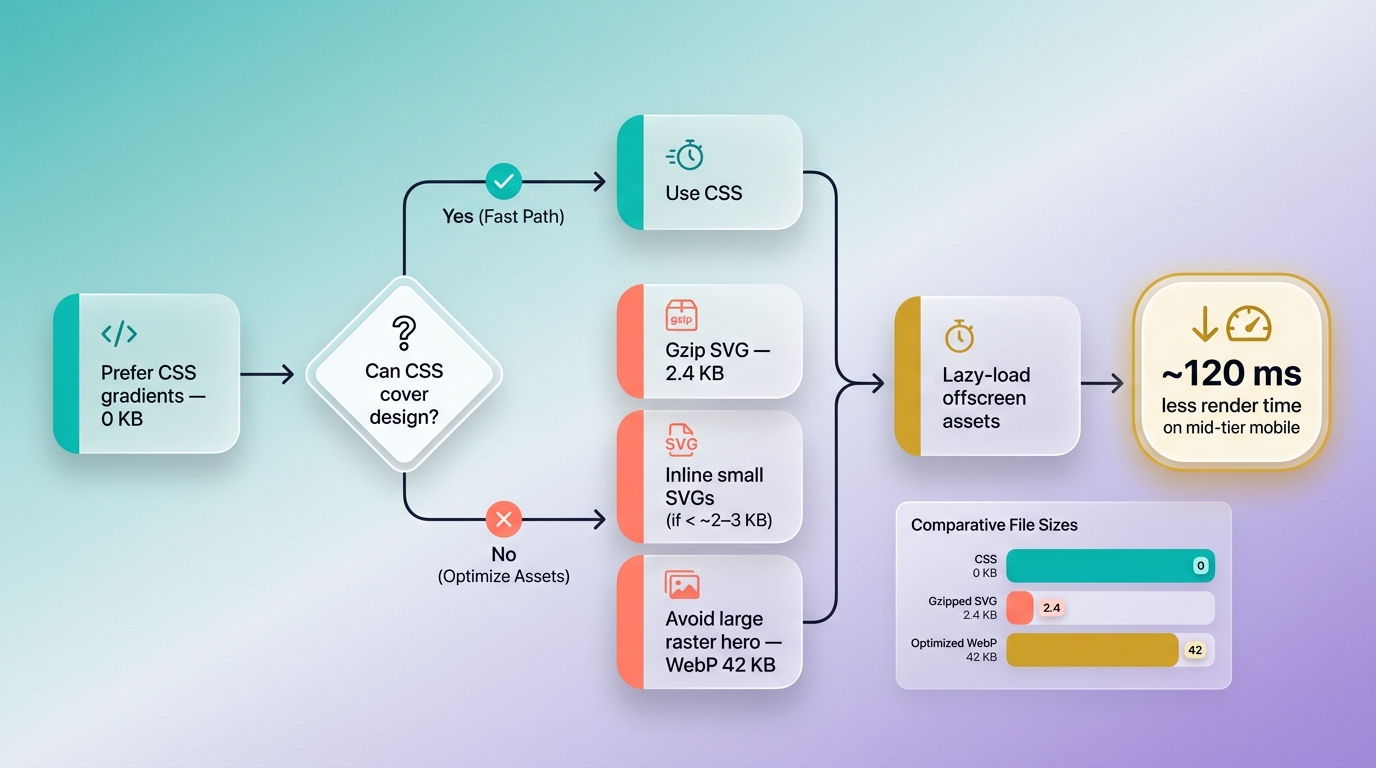
Concrete optimization steps: prefer CSS where possible, gzip SVG, inline small SVGs, avoid large raster for responsive hero areas, and lazy-load offscreen assets. Example file-size comparison for one hero look: CSS gradient 0 KB, gzipped SVG 2.4 KB, optimized WebP 42 KB. That difference translates to 120 ms less render time on a mid-tier mobile device when using CSS or SVG.
Animating gradients responsibly and integrating gradient tokens into design systems
Animate opacity and transform on layered pseudo-elements to remain GPU-friendly. Avoid continuous large-blur repaint animations, and avoid animating background-position on large areas. Honor user preferences:
@media (prefers-reduced-motion: reduce){ .glow { animation: none; } }Animation types to avoid: constantly changing blur radii, heavy per-frame color recalculations. Test frames per second in devtools to ensure stable 60fps.
For systemization, create gradient tokens named by intent and version, for example:
- gradient.hero.v3.primary
- gradient.bg.subtle.v1 Version updates should be accompanied by migration notes and a visual spec. Enforce three rules: always test contrast numerically, prefer CSS or compressed SVG exports, and version hero gradients for rollback.
Conclusion
Adopting colorful gradient backgrounds demands intentional palette selection, numeric accessible contrast enforcement, and production-aware implementation. Use CSS or small SVGs where possible, animate conservatively, and bake gradient tokens and versioning into your design system so hero gradients and SwiftGlow gradients become repeatable, accessible, and performant brand tools.


