Logo Design Decisions: Practical Rules for Stronger Brand Visuals
How to Choose Logo Elements That Actually Support Your Brand Goals
A logo should do three things well, in order: communicate who you are, work reliably where people will see it, and scale with your ambitions. Too many design conversations start with style instead of purpose. Start by asking which business outcome you want from your logo right now, then pick the visual moves that directly support that outcome.
A logo without a goal is styling, not strategy.
Choose visuals that map to a measurable brand outcome.
Your logo decisions should be defensible, not just pretty.
Translate brand attributes into visual decisions (exercise)
Turn adjectives into micro-decisions. Use this quick exercise to map brand attributes to concrete design choices. Complete one row per attribute.
-
Attribute: e.g., Trustworthy
-
Shape language: geometric, stable forms (squares, strong verticals)
-
Weight: medium to bold strokes
-
Typography: sturdy serif or humanist sans with low contrast
-
Color choices: desaturated blue or deep green
-
Spacing: generous clearspace, even margins
-
Testing priority: offline print legibility, small-size trust signals (badges)
-
-
Attribute: e.g., Playful
-
Shape language: rounded corners, irregular baseline
-
Weight: light to medium
-
Typography: open counters, friendly rounded sans
-
Color choices: high-saturation accents, 1 neutral + 1 pop color
-
Spacing: tighter negative space for compact avatars
-
Testing priority: social avatar recognition, animation compatibility
-
-
Attribute: e.g., Premium
-
Shape language: refined, high-contrast strokes, minimalism
-
Weight: higher stroke contrast or thin strokes paired with bold mark
-
Typography: classic serif or custom ligatures
-
Color choices: near-black, warm gold, deep navy
-
Spacing: wide clearspace, simplified mark
-
Testing priority: print quality, embossing, small label legibility
-
Do this for 4 to 6 core attributes. The output becomes a decision matrix you consult on every micro-decision. If a choice contradicts the attribute mapping, pause and ask why.
Which logo architecture matches your growth stage
Pick architecture based on current goals, not aesthetic trends. Below is a prioritized decision framework so you can choose fast.
-
Wordmark (full name)
-
Use when: you want name recognition, your name is short or unique, legibility is critical.
-
Pros: immediate name visibility, good for SEO and headers.
-
Cons: long names can become illegible at small sizes.
-
Trade-off rule: choose a wordmark if your primary goal is awareness or brand recall.
-
-
Lettermark (initials)
-
Use when: name is long or you expect frequent abbreviated use, or you need a compact token for apps.
-
Pros: compact, easy to scale, strong symbol potential.
-
Cons: takes longer to teach audience the full name.
-
Trade-off rule: choose a lettermark when scalability and tight spaces matter.
-
-
Symbol / Brandmark (icon)
-
Use when: product signaling or global expansion is the focus, and you can invest in building recognition.
-
Pros: versatile, memorable, works across languages.
-
Cons: large initial investment to teach meaning.
-
Trade-off rule: choose symbol if your product will be recognized without the name, or if you need a strong app/fav icon.
-
-
Combination mark (word + symbol)
-
Use when: you need both name clarity and a scalable symbol for avatars and app icons.
-
Pros: flexible, covers both awareness and token needs.
-
Cons: can be larger visually; requires responsive system.
-
Trade-off rule: default choice for early-stage brands; replace or pare down as recognition grows.
-
-
Emblem (seal or badge)
-
Use when: heritage, certification, or community identity is desired.
-
Pros: conveys authority, works on physical goods.
-
Cons: poor scalability and small-size legibility.
-
Trade-off rule: choose only if physical labels or membership signaling are primary.
-
Decision heuristic: prioritize recognition speed if you need quick engagement (social ads, thumbnails), prioritize legibility when conversion depends on trust (checkout, official docs), and prioritize emotional resonance for lifestyle or premium brands.
Design Moves That Improve Recognition and Usability
Practical micro-decisions move the needle more than stylistic flourishes. Here are the high-impact moves to apply now.
Simplicity improves recognition, complexity kills it.
Optimize for the smallest context your audience uses first.
Small tweaks to type and spacing deliver the biggest returns.
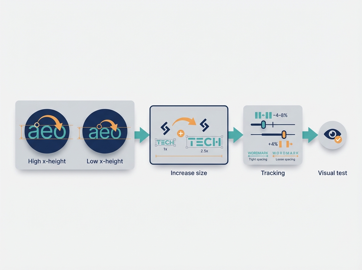
Typography decisions that increase legibility and memorability
-
Choose type with a high x-height for small sizes. A larger x-height keeps lowercase counters open and readable. If you cannot change type, increase the font-size of the wordmark relative to the symbol.
-
Control letter spacing by size. Rule of thumb: reduce tracking by 4 to 8 percent for smaller sizes, increase by 4 percent for very large display use. Test visually rather than trusting numeric values alone.
-
Prefer open counters and wide apertures. Avoid condensed or ultra-light faces for logotypes that will appear at small sizes.
-
Consider custom letterforms only when they solve a specific differentiation problem, not for ornamentation. Custom letters are useful for unique ligatures and distinct terminals that survive low-res contexts.
-
Micro-decision example: If your logotype will appear at 24 px on mobile headers, choose a typeface whose lowercase a, e, and o retain clear counters at that pixel size during mockups.
Practical tests: Render your wordmark at 18 px, 24 px, 40 px. If you need to squint or zoom to read at 18 px, redesign.
Shape language, negative space, and the power of simplification
-
Use simplified geometry. Reduce stroke complexity so the core silhouette survives downsampling and compression artifacts.
-
Exploit negative space for recognition, but keep it bold. Tiny cutouts vanish at small sizes. If negative space is central, test at 32 px and 48 px.
-
Avoid thin hairlines unless you have a bold, simplified alternate for small contexts.
-
Micro-decision: When creating a symbol, restrict to 2 geometric primitives, or simplify to a single recognizable contour.
-
Visual suggestion: show before/after simplification: the original complex crest at 180 px and the simplified contour at 40 px.
Responsive logo design: creating variants for every size
Build a responsive logo system with 3 to 5 variants, and name them clearly: full, stacked, horizontal, symbol, micro. Here are practical breakpoints and uses.
-
Full logo: desktop header, 180 px width+.
-
Stacked / compact: mobile nav and narrow spaces, 80 to 120 px.
-
Horizontal: footer and wide headers, 160+ px.
-
Symbol-only: social avatars, favicons, app icons, 40 to 80 px.
-
Micro mark: favicon and small tokens, 16 to 24 px simplified silhouette.
Minimum readable sizes:
-
Logotype with lowercase: aim for legibility at 18 to 24 px on standard displays.
-
Symbol recognition: test at 40 px wide for social avatars.
-
Favicon / micro icon: simplify to a single shape readable at 16 px.
Call-out mockups to include in documentation: show mobile icon at 40 px, header at 180 px, and favicon at 16 px side by side.
Color, Contrast, and Accessibility Rules That Matter
Color choices affect recognition, accessibility, and brand equity. Treat color systems as tools, not decorations.
Colors are functional brand assets, treat them like tokens.
Your logo should work in full color, grayscale, and single color.
Contrast decisions are not optional, they are usability requirements.
Building a color system that works in digital and print
-
Build a primary palette of 1 dominant + 1 supporting neutral + 1 accent. Add system colors for backgrounds, surfaces, and states.
-
Specify color values across outputs: HEX, sRGB, Pantone, CMYK, and recommended use cases.
-
Define a light and dark logo lockup. Create direct swaps for background colors rather than relying on color inversion.
-
Example: Primary blue HEX #0A57A3, supporting neutral HEX #F7F8FA, accent coral HEX #FF6B4A. Specify Pantone equivalents for print.
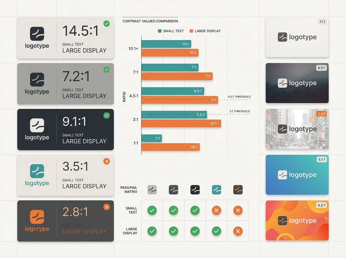
Contrast thresholds and testing for real-world legibility
-
For logos with text, use WCAG contrast guidelines as a baseline. Aim for 4.5:1 for small text on UI, 3:1 for large display text. For logos, target minimum 3:1 against background for the symbol, and 4.5:1 for any logotype text that functions as content.
-
Test color pairs on at least five real backgrounds: light paper, dark web hero image, photo overlay, app gradient, and social post image.
-
Use automated contrast tools, then validate in real images with mockups. Contrast tools do not detect busy backgrounds; mockups do.
Grayscale and single-color checks for versatile use
-
Convert your logo to grayscale and single-color early. If the logo fails in single-color, redesign.
-
Print a one-color version at 1 inch and 0.25 inch sizes to check for loss of detail.
-
Micro-decision: Create a single-color vector and ensure the contour holds at 300 dpi printing and at 72 dpi screens.
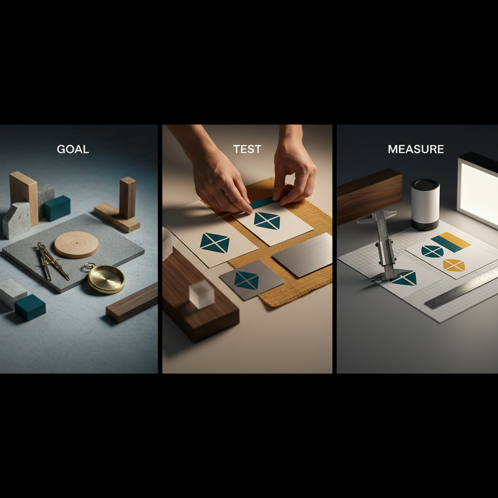
Test, Measure, and Iterate: A Practical Validation Playbook
You need objective methods to prove your logo works. Rely on measurable tests and quick feedback loops.
Test like you ship a product, not judge like an artist.
Use objective thresholds and small experiments to validate changes.
Faster iterations beat perfect theory.
Rapid tests: recognition, context mocks, and micro-surveys
-
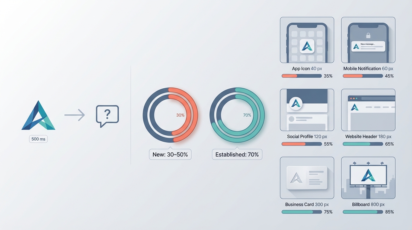
Blind recognition test
-
Method: show the logo alone for 500 milliseconds, followed by a prompt asking if the symbol is familiar or guess the brand category.
-
Threshold: for new logos, aim for 30 to 50 percent category recognition in your target sample after soft launch; for established brands, aim for 70 percent.
-
-
Context mocks
-
Create six contexts: app icon at 40 px, website header at 180 px, social avatar at 80 px, printed business card at 300 dpi, favicon at 16 px, and product label at expected shrink size.
-
Verify readability and parallax against typical backgrounds.
-
-
Micro-survey template (3 questions)
-
Q1: What industry do you think this brand is in? (open or multiple choice)
-
Q2: On a 1 to 5 scale, how trustworthy does this logo look? (1 low, 5 high)
-
Q3: Would you remember this logo after a week? (Yes/No)
-
-
Recruitment: run the micro-survey on 30 to 100 respondents from your target audience. Use social stories or MicroSurveys in product flows for quick samples.
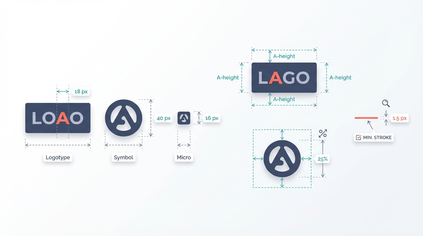
Objective thresholds: minimum size, clearspace, and contrast ratios
-
Minimum readable sizes: logotype 18 px, symbol 40 px, micro mark 16 px.
-
Clearspace rule: minimum clearspace = height of the uppercase letter "A" in your logotype, measured from baseline to cap height. For symbols without type, use 25 percent of the logo mark height.
-
Stroke thickness: minimum visible stroke on screen should be 1.5 px at 100 percent scale for thin strokes. If your design requires thinner strokes, provide a bold fallback.
-
Contrast ratios: symbol vs background at least 3:1, text in logo meeting 4.5:1 where legibility is critical.
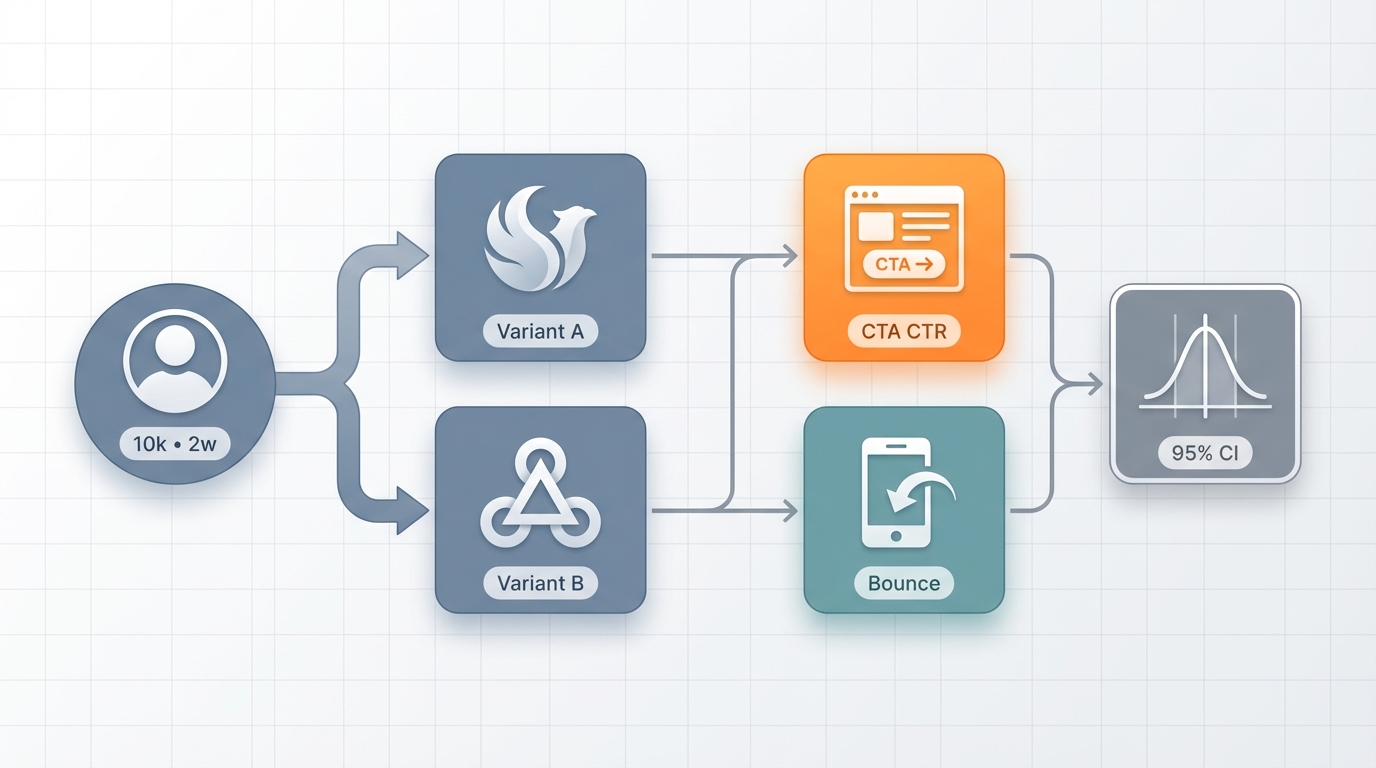
Using A/B tests and analytics to validate logo changes
-
Set up a staged A/B test when changing a primary logo visible to users. Compare conversion-relevant KPIs, not vanity metrics.
-
Example A/B framework:
-
Variant A: existing logo
-
Variant B: revised logo with simplified symbol
-
Sample: 10,000 unique visitors over 2 weeks
-
Primary KPI: homepage CTA click-through rate
-
Secondary KPI: bounce rate on mobile
-
-
Statistical threshold: aim for 95 percent confidence to claim a significant difference.
-
-
Track downstream signals: search volume for brand name, direct traffic lift, app installs after icon change.
-
If analytics are noisy, run small-scale preference tests and recognition tests to supplement.
Fixes for Common Logo Problems
Fixes should be surgical and measurable. Here are the most frequent failures and how to repair them.
Most logo problems are solvable with fewer lines, more contrast, and a better fallback.
Fix for context first, aesthetics second.
Measure before and after, even if the sample is small.
Overcomplicated logos: steps to simplify without losing identity
Problem: intricate emblem with small text and flourishes that vanish at 40 px.
Fix steps:
-
Identify the distinctive silhouette or motif. Remove secondary ornaments.
-
Create a single-color silhouette version and test for recognition at 16 px and 40 px.
-
Replace small textual elements with a separate wordmark in responsive lockups.
-
Validate: symbol recognition at 40 px improves by at least 20 percent in a blind test.
Example micro-repair: remove inner filigree, thicken primary contour by 30 percent, and produce a symbol-only version for avatars.
Trends vs. timelessness: when to lean in and when to resist
Problem: trending motif dates the brand after 2 years, hurting long-term equity.
How to decide:
-
If your brand is trend-driven (fashion, pop culture), a trend-forward logo can accelerate discovery, but plan to refresh every 3 years.
-
If your goal is longevity and trust, avoid ephemeral type treatments and faddish glyphs.
-
Hybrid approach: make the core symbol neutral, then layer trend-forward color and motion for campaigns.
Logo failures in application: solving scaling, alignment, and spacing issues
Common fixes:
-
Scaling: produce simplified variants for each breakpoint, do not scale a single SVG down to favicon sizes without a micro mark.
-
Alignment: document baseline alignment rules, e.g., align the bottom of the icon to the baseline of the logotype for stacked locks.
-
Spacing: set absolute clearspace metric and show misuse examples in a brand guideline one-pager.
Before/after critique example: a logo with equal stroke widths looked balanced at 200 px but collapsed at 40 px. After: introduce a micro mark with a single solid shape and increase stroke thickness by 50 percent in the 40 px asset.
Deliverables, Handoff, and Brand Protection
Make your handoff frictionless. Developers and vendors should be able to implement the logo without guesswork.
File precision prevents implementation errors.
Document rules once, use them everywhere.
Legal checks should shape design, not follow it.
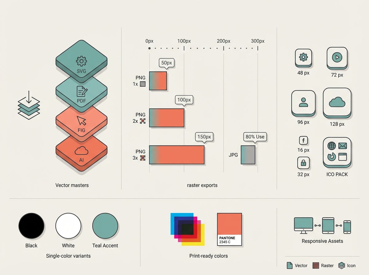
File formats, responsive assets, and documentation to include
Provide these files and resources with every final delivery:
-
Vector masters: editable SVG and layered PDF, and source file (Figma, Adobe Illustrator).
-
Raster exports: PNG 1x, 2x, 3x for key sizes; JPG for photos if needed.
-
Single-color variants: black, white, and one approved accent.
-
App icons: 48 px, 72 px, 96 px, 128 px, plus platform-specific packs.
-
Favicon set: 16 px, 32 px, ICO pack.
-
Print-ready files: CMYK PDF and Pantone references.
-
Responsive assets: full, stacked, symbol, and micro mark named and organized.
-
Brand guide one-pager: clearspace, minimum sizes, unacceptable uses, color codes, typography specs, grid and alignment rules.
-
Interaction hints: recommended animation triggers and masking behavior for digital motion.
Visual asset suggestion: include a "handoff snapshot" mockup showing each variant with label, pixel size, and recommended export name.
Handoff checklist for developers, marketers, and printers
-
Provide vector master and PNG/PNG-2x for specified sizes
-
Include color codes in HEX, sRGB, CMYK, Pantone
-
Supply CSS snippet for web usage, example:
-
.brand-logo { width: 180px; height: auto; } -
.brand-symbol { width: 40px; height: auto; }
-
-
Attach usage examples: header, app icon, social avatar, print label
-
Confirm safe area and clearspace rules
-
Provide fallback fonts or webfont license information
-
Include accessibility notes: contrast targets, alt text examples
Trademark basics and how legal constraints should influence design
Minimal legal checklist to run before finalizing logos:
-
Distinctiveness check: avoid names or marks that are descriptive of goods or services. Generic terms are harder to protect.
-
Preliminary trademark search: run USPTO TESS or your local trademark database to check for identical or confusingly similar marks in your class.
-
Domain and social handle checks: verify availability of key domains and handles to prevent launch conflicts.
-
Avoid famous marks: do not imitate or reference established logos, colors, or shapes that are trademarked.
-
Consult counsel: for launch markets in multiple countries, get a trademark attorney to file and advise.
Design implications: if a preferred concept uses a common geometric motif, add a unique detail or custom letterform to increase distinctiveness and registrability.
Two Case Studies: Small Brand Logo Redesigns That Improved Outcomes
These compact studies show specific micro-decisions and plausible KPI improvements. Metrics are hypothetical and labeled as estimates.
Small changes can yield measurable results when combined with testing.
Treat logo redesign like a product feature with measurable goals.
Always validate with context mocks and simple A/B tests.
Case study A: clarity and legibility fixes that boosted recognition
Scenario: A niche newsletter had a serif wordmark that looked elegant at large sizes but blurred into an illegible squiggle in social avatars. Problem hurt discovery on Instagram and Twitter.
Actions taken:
-
Swap to a humanist sans with higher x-height for the wordmark.
-
Create a symbol from the first letter with simplified counter and single contour.
-
Set responsive variants: full wordmark for email and header, symbol for avatars at 80 px and below.
-
Test: blind recognition and micro-survey on 50 followers.
Results (hypothetical):
-
Social avatar recognition rose from 22 percent to 56 percent in a blind category test.
-
Click-throughs from social posts increased 12 percent in the two weeks after rollout.
-
Time to recognition in a timed test fell from 900 ms to 420 ms.
Takeaway: one micro-decision, selecting a higher x-height typeface and adding a symbol, moved discovery metrics.
Case study B: adaptive redesign for platform constraints with performance notes
Scenario: A SaaS product had a detailed emblem used on desktop. When released as a mobile app, the emblem was unreadable at 48 px and interfered with conversion.
Actions taken:
-
Create a micro mark using the product's negative-space motif.
-
Design a dark and light icon with 3-color palettes optimized for app store thumbnails.
-
Run an A/B test on a subset of users showing old icon versus new icon in push notifications.
Results (hypothetical):
-
Push notification open rates improved from 3.8 percent to 4.6 percent.
-
App store conversion from view to install increased 7 percent.
-
Overall brand search queries rose 4 percent within a month.
Takeaway: solving small-scale usability problems, like icon legibility, can lift product metrics and reduce friction.
Conclusion
Logo design is a decision process, not a one-off creative sprint. Start by aligning your logo choices to a clear brand goal, then make measurable micro-decisions about type, shape, color, and responsiveness. Test early and often using objective thresholds: minimum sizes, clearspace, and contrast ratios. Deliver precise files and rules so others can implement your brand without guessork. Finally, protect your work with basic trademark checks so your design assets become lasting value for your brand.
Recommended assets to include with this article: responsive size comparison mockup, contrast failure examples, before/after simplification sheet, handoff resources snapshot, and a mobile app icon test. Provide a downloadable one-page checklist and a starter Figma file to speed implementation.
Quick final checklist you can copy:
-
Define primary brand outcome for logo (awareness, trust, signaling)
-
Select architecture (wordmark, symbol, combo) using the decision framework
-
Build 3 to 5 responsive variants and export required sizes
-
Set minimum sizes, clearspace, and contrast targets (logotype 18 px, symbol 40 px, contrast 3:1+)
-
Run a blind recognition test and a short micro-survey
-
Deliver vector masters, PNGs, color codes, and a one-pager guideline
-
Perform a trademark search and consult counsel if needed
Use this process and these rules as your baseline. With them, you will make smarter logo decisions that strengthen your visuals and your brand identity.


