Gradient Backgrounds in Web Design: Storytelling and Accessibility
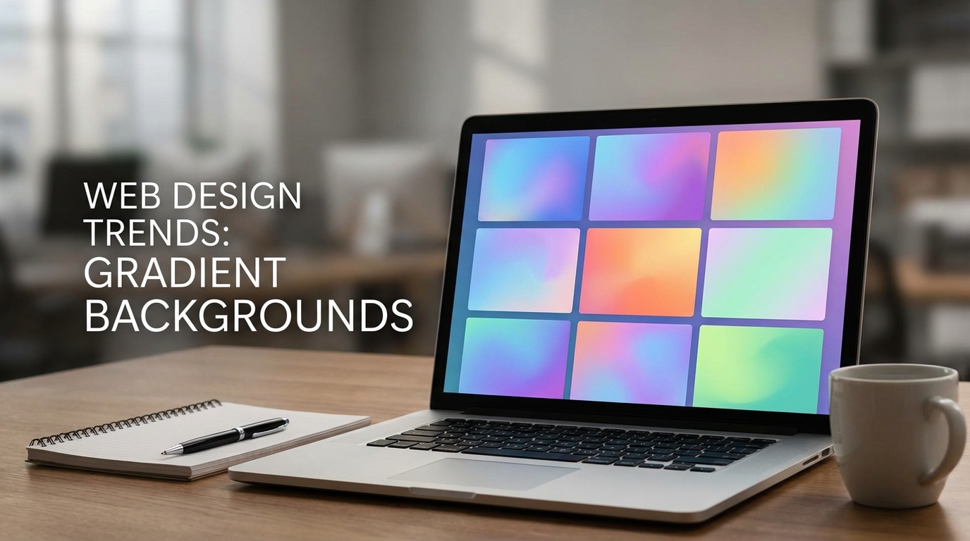
The Emotional Power of Gradient Backgrounds in Web Design
Colour storytelling through gradients
Gradient background as a design element is more than a decorative flourish. It can encode movement, value shifts, and a brand’s personality in a single visual gesture. A slow, cool transition can evoke calm trust, while a bold, warm blend can signal urgency or optimism. When used in hero sections, gradients help guide the eye toward a call to action, creating a narrative arc from mood setting to action. This is not merely color theory in action; it’s storytelling through pixel-level nuance, where subtle shifts in hue, saturation, and lightness frame the user journey.
Brand mood vs technical constraints
Brand storytelling with gradients relies on consistent color logic across pages, not just a pretty header. A gradient can mirror a product’s evolution, hint at industry positioning, or cue a target audience. Yet gradients must coexist with legibility, performance, and accessibility. The best executions balance emotional impact with technical constraints like contrast, load time, and device variability. When gradients align with brand values, they become a navigational cue, a mood setter, and a visual signature that endures beyond trends. See how gradient overlays can reinforce hierarchy without overwhelming content, and how a well designed gradient background can reinforce brand storytelling with gradients as a framework rather than a distraction. For broader strategy, planning around a cohesive system is essential, as discussed in resources on a cohesive design system.
How to Choose Gradient Palettes That Align with Your Brand
From color theory to palette maps
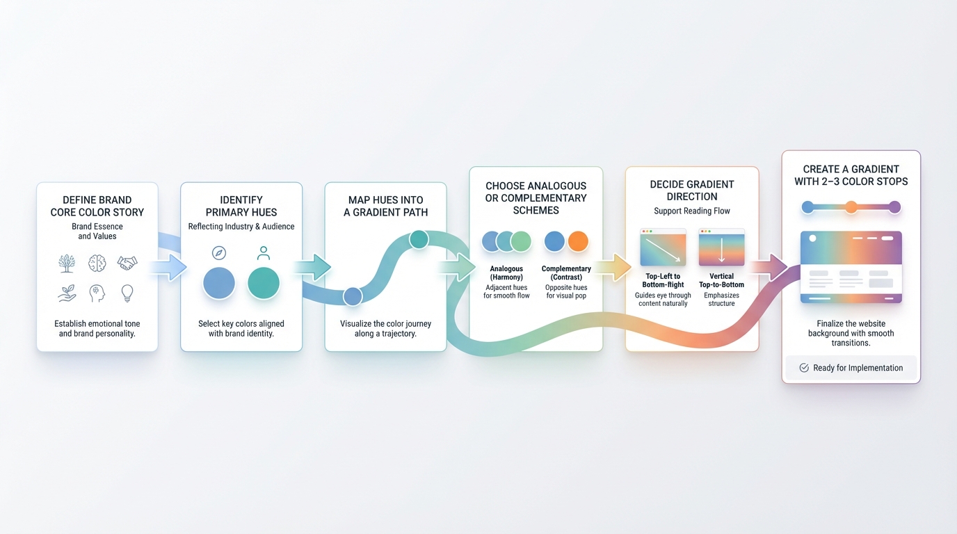
Choosing a gradient palette starts with the brand’s core color story. Identify primary hues that reflect industry and audience, then map them into a gradient path that can be consistently applied across surfaces. Use analogous or complementary schemes to maintain harmony, and decide the direction that best supports your typical reading flow. A gradient map can be kept simple with 2–3 color stops for most hero sections, or expanded to 4–5 stops when depth and texture are required. In practice, many teams pair color theory with brand mood notes, translating qualitative attributes into quantitative stops and transitions so that the gradient feels intentional rather than decorative.
Practical rules for color stops and transitions
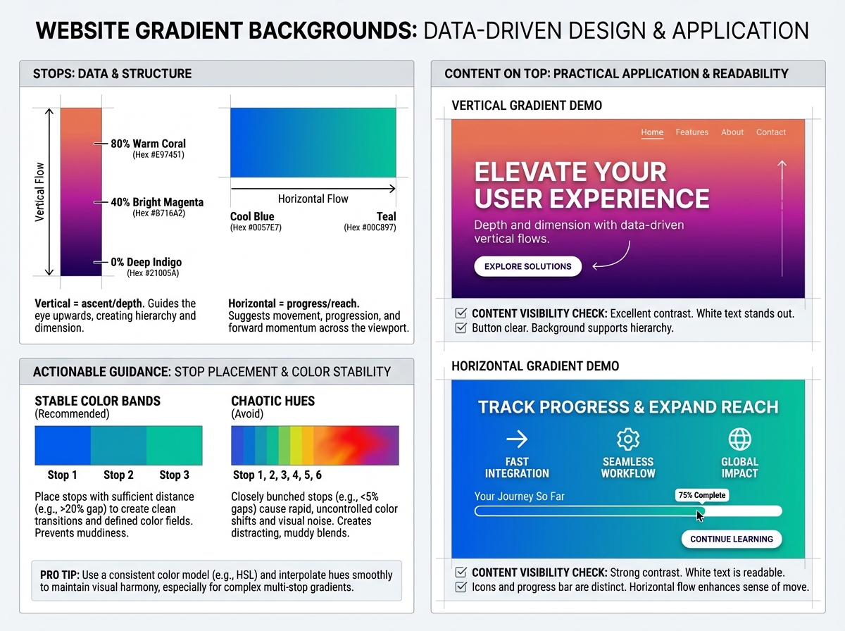
Practical gradient construction favors predictability. Place stops at clear percentages (for example 0%, 40%, 80%) to create stable bands of color that still feel dynamic. Avoid overcrowding with chaotic hues; instead test the perceived hue motion as content sits on top. Direction matters: a vertical gradient can imply ascent or depth, while a horizontal shift can imply progress or reach. When in doubt, sample palettes from real brand assets and refine with a color ramp that supports legibility. For palette inspiration, consider exploring curated ideas like our summer gradient palettes guide to spark ideas while keeping the focus on brand alignment and readability.
If you're experimenting during implementation, tools that generate gradient maps or mesh gradients can accelerate exploration. InstantGradient's mesh gradient tool provides flexible control over color nodes and smoothness, helping designers prototype complex transitions before committing to code. This approach supports rapid iteration while preserving a coherent brand voice, and it can bridge the gap between mood boards and CSS output.
For teams aiming for consistency, anchor gradients to a cohesive design system that connects to typography, imagery, and UI components. A well documented gradient system works alongside a cohesive UI vocabulary and brand guidelines, reinforcing recognition across touchpoints.
Making Gradients Accessible: Readability and Contrast
Techniques to ensure text remains legible
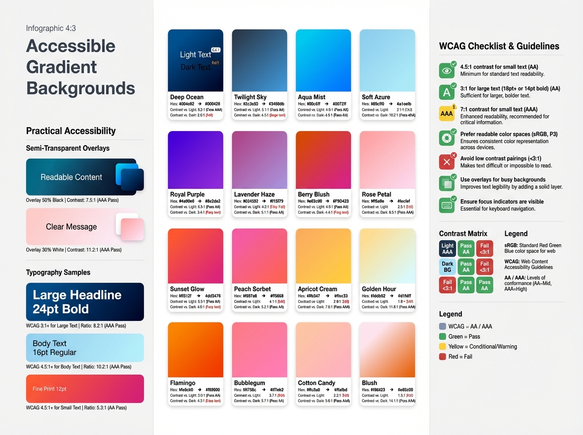
Accessible gradient backgrounds require explicit attention to contrast, readability, and color spaces. Text over a gradient should meet WCAG contrast standards or be supported by a readable overlay. Techniques include using a semi transparent color layer between text and background, selecting text colors with sufficient luminance contrast, and employing typographic choices with clear legibility on variable backdrops. When gradients become complex, prefer higher contrast text colors and avoid placing pure white or pure black text directly on busy portions of the gradient. Using readable type scales and sufficient line-height helps maintain legibility across devices. For a deeper dive into WCAG compliance and testing methods, see our guide to creating accessible gradient backgrounds.
Testing across devices and color spaces
Accessible gradients demand testing beyond a single screen. Check color contrast with real content on mobile, tablet, and desktop, and evaluate in diverse color spaces. Prefer motion-reduced experiences for users who have motion sensitivity, and provide a non animated fallback for users who disable gradient motion. For more in depth guidance, see resources on accessible gradient backgrounds, which offer concrete rules and testing approaches you can apply during design and development cycles.
Techniques for Implementing Gradient Backgrounds: CSS, SVG, and Beyond
Layered gradients for depth and motion
CSS gradient techniques enable layered effects that convey depth without heavy imagery. Combine multiple gradients with different directions and opacities to create subtle volumetric space. Gradient overlays placed above content can push the foreground forward while preserving legibility, especially when paired with color-matched typography. SVG gradients offer crisp rendering on high DPI displays and can be animated for nuanced motion that remains performant.
Performance considerations and fallbacks
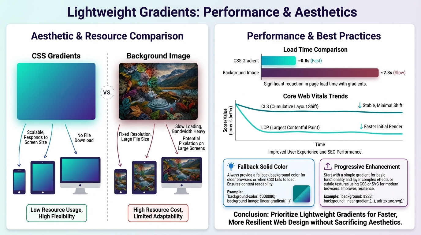
Performance is a design constraint as much as an aesthetic choice. Lightweight gradients render faster and reduce layout shifts, particularly on mobile networks. Prefer CSS gradients over large background images when possible, and implement progressive enhancement by delivering clean solid color fallbacks for devices with limited rendering capabilities. For more advanced gradient generation options, a mesh gradient generator can be used during design exploration, keeping production code lean while preserving flexibility. When gradients are central to the brand, document fallbacks and provide a graceful degradation path to preserve storytelling when gradients cannot render fully. Embedding gradient techniques within a cohesive system also helps ensure consistency across pages and components.
Designing Gradient-Driven Experiences at Every Screen Size
Responsive gradient strategies and media queries
Gradients should scale gracefully from mobile to desktop. Use fluid color stops or CSS variables that adjust with viewport width, and test gradient density on narrow screens where readability is most at risk. Media queries can adapt direction or intensity to preserve mood without overpowering content. The aim is to maintain the same emotional signal while the geometry of the screen shifts, so the user experience remains coherent as they move through layouts, cards, and product pages.
Subtle motion and interaction without overbearing effects
Motion can emphasize brand storytelling with gradients, but overuse harms accessibility and performance. Subtle parallax or micro-interactions on scroll can reveal secondary color stops, creating a sense of momentum without distraction. Respect user motion preferences and provide control where feasible. The strongest gradient experiences use motion to reinforce intent, not to force attention away from core content. A well crafted gradient background supports a narrative about the product while keeping the UI readable, navigable, and fast.
Case Studies: Websites That Use Gradient Backgrounds Effectively
Case Study 1: What works and why
A product site uses a multi stop gradient behind its hero to convey innovation and approachability. The gradient direction guides the eye toward the primary CTA, while a light text treatment maintains contrast. The team layered a soft overlay to prevent content from competing with the backdrop, a technique that demonstrates accessible gradients in practice. The result is an immediate sense of brand personality with minimal performance overhead, and the gradient system ties into typography and button styling for a cohesive design language. Emulating this approach translates well when building a cohesive design system that keeps gradients consistent across pages.
Case Study 2: Lessons learned from deployment
A portfolio site experimented with a bold diagonal gradient to evoke momentum. While the mood was strong, content readability suffered on certain devices until the team added a translucent overlay and adjusted color stops for mobile breakpoints. They also tested with motion preferences and implemented a reduced motion variant for users who prefer it. The lesson is to separate mood from content in the most sensitive regions and to anchor gradient choices to brand storytelling with gradients that align with user needs. The experience underscores the value of progressive enhancement and thoughtful testing across breakpoints to avoid common pitfalls.
Conclusion
Gradient backgrounds are a powerful storytelling device when tied to brand personality, accessibility, and performance. They should be planned like a narrative element, with palette maps, contrast strategies, and responsive behavior that scales across devices. Implementations that layer gradients, apply thoughtful overlays, and leverage both CSS gradient techniques and SVG when appropriate can deliver depth without sacrificing readability. The most enduring gradient experiences balance emotional impact with pragmatic constraints, ensuring that the gradient background supports, rather than competes with, user comprehension and engagement. For ongoing inspiration and practical frameworks, consider exploring resources on a cohesive design system and accessible gradient backgrounds, and keep an eye on palette ideas like Summer Gradient Palettes as you evolve your brand storytelling with gradients. If experimentation is needed, the mesh gradient generator offers a way to prototype complex transitions while maintaining production simplicity. Finally, anchor your practice in real-world case studies that reveal both success and lessons learned, so the next gradient background you deploy strengthens brand storytelling with gradients.


