Website Design Inspiration: Build a Cohesive Design System
Curating web design inspiration for your brand
Inspiration should be a starting point, not a blueprint. The aim is to extract repeatable patterns that fit a brand’s niche, then translate them into a design system built for accessibility, performance, and future growth. A disciplined workflow, from collection to implementation, helps teams turn mood boards into tokens, components, and reusable patterns that scale.
Finding credible sources for website design ideas
Sourcing credible website design ideas means favoring curated, reputable resources that reveal context, goals, and constraints. Evaluate relevance to the brand’s niche by checking audience alignment, tone, and messaging, not just visuals. Look for layouts that solve real problems, typography that supports readability, and motion that reinforces meaning rather than spectacle. When color matters, consult color trends to guide token evolution, and don’t overlook accessibility from the start. For hands-on exploration, experiment with a mesh gradient generator to spark ideas for gradient accents that can inform branding components. Consider also accessible gradient backgrounds to anchor inclusive visuals. Seasonal cues can be instructive too; summer gradient palettes offer fresh, temporary inspiration that can be adapted into durable tokens. For ongoing context, the Instant Gradient blog provides a broad hub of gradient design ideas and tutorials.
Interpreting design inspiration to fit your brand voice
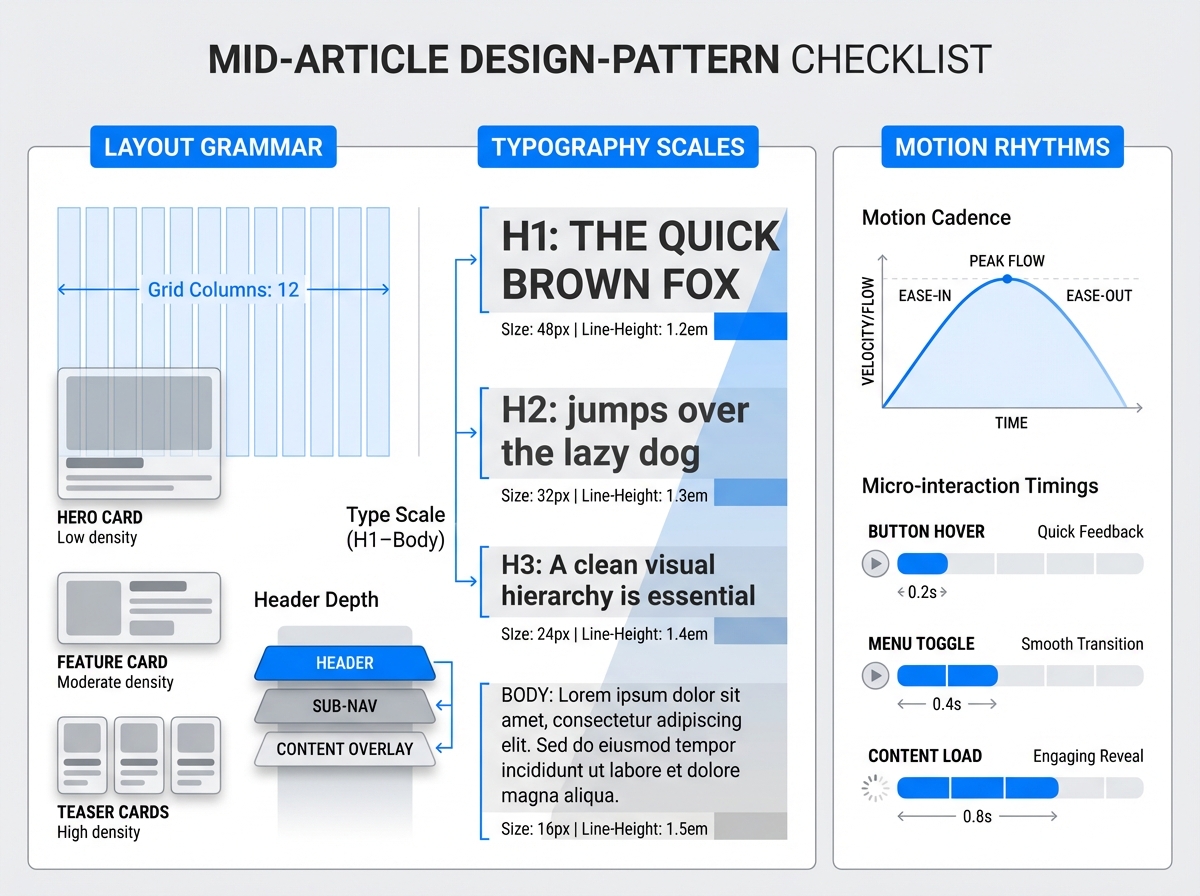
Patterns matter more than exact assets. Identify layout grammar (grid behavior, card density, header depth), typography scales, and motion rhythms that recur across credible examples. Translate those cues into a brand-specific voice: a friendly tech startup might favor generous whitespace and subtle micro-interactions, while a premium design studio may lean into restrained grids and refined typographic contrast. The goal is to preserve the essence without copying mechanics, so teams map each cue to a brand personality decision: what to keep, what to adapt, and what to reject; then document that rationale in a design brief.
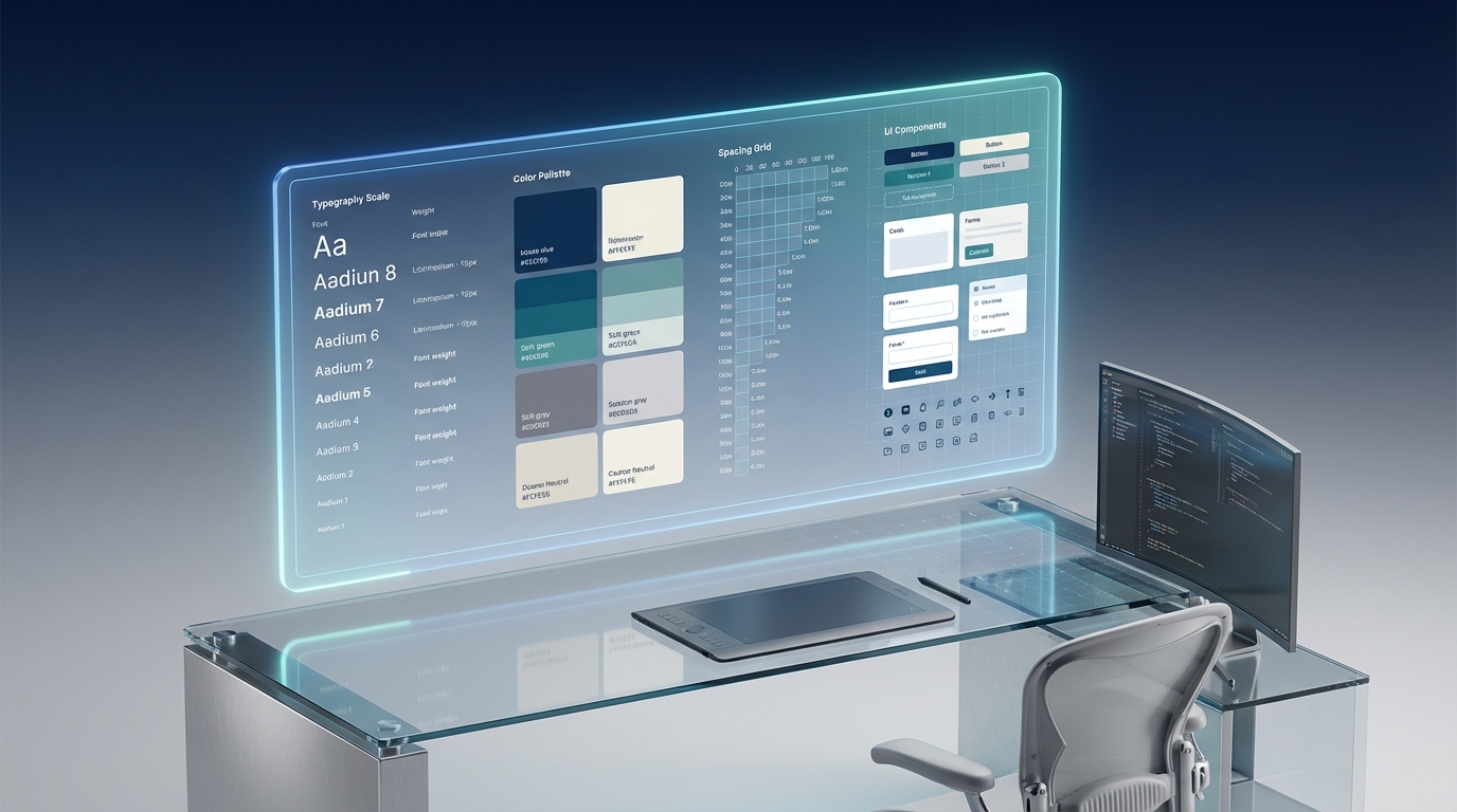
Turning inspiration into a cohesive design system
A cohesive design system turns cues into tangible tokens, components, and reusable patterns. Start with design tokens: color palette, typographic scale, spacing system, border radii, shadows, and motion curves. Build components (buttons, navigation, cards) that reference those tokens, ensuring consistent shape language and interaction states. Maintain a living design library linked to a clear brand brief, so new pages reuse proven patterns rather than reinventing the wheel. When assessing design trends for websites, understand when to adopt them and when to resist in favor of enduring usability and accessibility. Trends can energize a system, but timeless usability (and performance) should govern long-term decisions. For ongoing inspiration, consult the broader Gradient and color content from resources like the Color Trends hub and related posts.
Avoiding copying: ethical and practical boundaries
Copying is risky: legally, ethically, and in terms of brand integrity. Attribute where appropriate, respect licenses, and seek originality in how patterns are reinterpreted for the brand. Use inspiration to inform decisions, not to reproduce assets wholesale. Always audit for accessibility and performance implications; a striking visual that fails WCAG or slows down pages undermines the design system.
From inspiration to implementation: a practical workflow
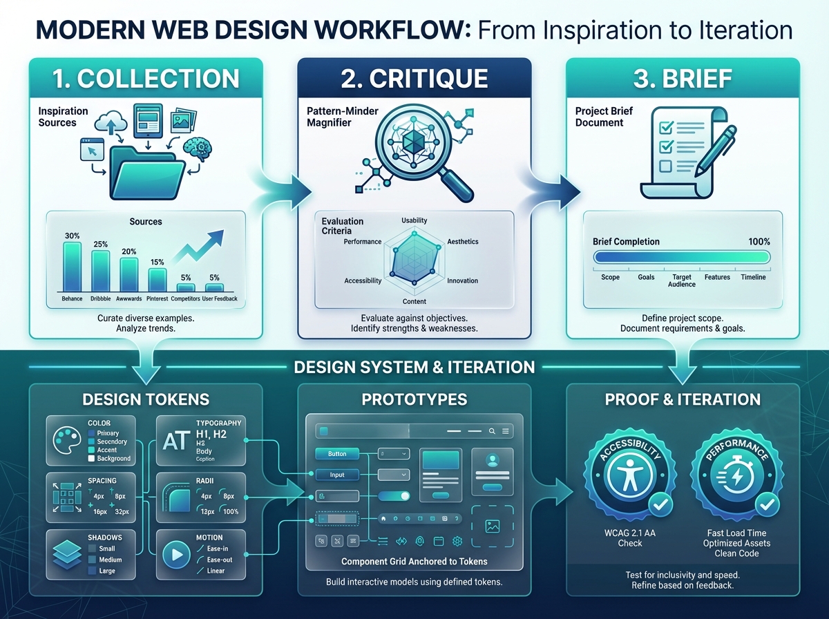
- Collection: assemble sources with a note on why they matter.
- Critique: extract patterns (layout, typography, motion) and assess fit.
- Brief: formalize goals, constraints, and brand voice.
- Design tokens: define color, typography, spacing, radii, shadows, motion.
- Prototypes: build components and patterns anchored to tokens.
- Proof and iteration: test accessibility, performance, and user feedback; refine tokens and components accordingly.
Case study: a hypothetical project, Nova Studio, begins with a curated mood set from credible web design sites; tokens emerge for a modular grid, a bold-but-readable type scale, and a gradient-accented button system. The team drafts a component library, validates contrast, and achieves measurable gains in consistency and iteration speed, while accessibility scores improve as gradients and motion stay within defined thresholds. This end-to-end pipeline, informed by seasonal cues like summer gradient palettes, yields a scalable design system that remains true to brand voice.
Conclusion
A disciplined, token-driven workflow turns design inspiration into a living design system that respects brand personality, accessibility, and performance. By curating credible sources, interpreting cues thoughtfully, and validating through practical implementation, creators can achieve consistent experiences across platforms and time. For ongoing ideas and deeper gradient guidance, explore the Instant Gradient blog and related resources such as accessible gradient backgrounds, mesh gradient generator, summer gradient palettes, and color trends.


