Gradient Backgrounds for Websites: Design, Accessibility, and Tests

Why Gradients Still Drive Brand Perception
Gradients remain a potent visual lever when you need to convey personality quickly on websites featuring gradient backgrounds, but they are not purely decorative. Your choices about color stops, direction, and saturation change perceived brand traits: saturated, high-contrast stops read energetic and disruptive; low-saturation, monotone ramps read refined and trustworthy. Use the article gradient backgrounds in web design and storytelling to ground narrative choices in examples and to decide when a gradient strengthens brand perception versus when it distracts.
How color stops and direction alter emotional tone
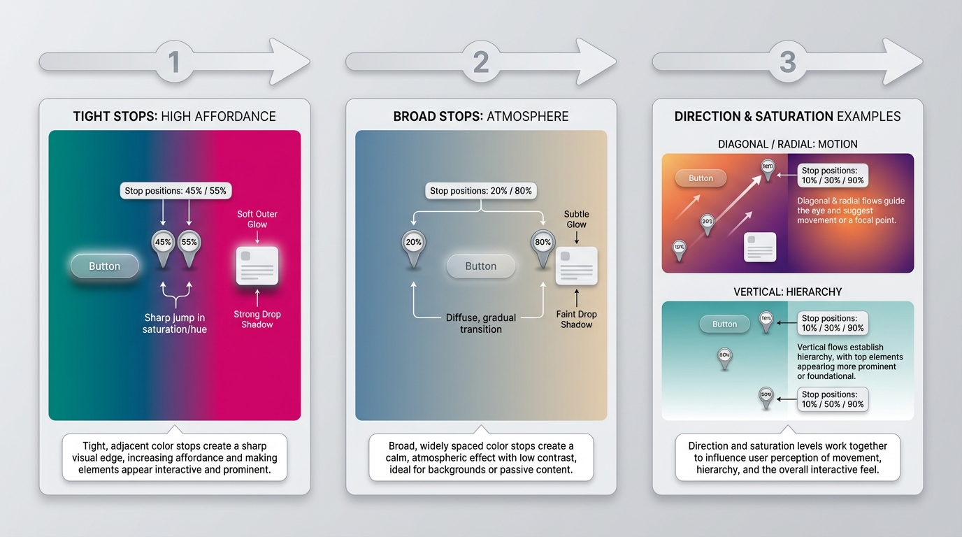
Color stop placement compresses or expands perceived depth. Tight, high-contrast stops near an interactive element make it pop, increasing affordance. Broad, diffuse stops create atmosphere and slow visual scanning. Direction matters: diagonal and radial gradients create motion and exploration, vertical ramps suggest hierarchy and stability. Saturation and contrast determine whether a gradient should be a primary brand treatment or a subtle accent. If text and CTAs must always sit on top, prefer low-saturation or masked gradients, or reserve vivid gradients for hero imagery only.
Choosing full-bleed backgrounds versus accent gradients
Full-bleed gradients are brand statements, useful when the hero carries the message. Accent gradients belong in components, cards, and overlays where they support information architecture without competing with content. Treat full-bleed gradients as product photography, subject to A/B testing against flat colors and photographic backdrops.
Real Website Case Studies and What They Teach You
SaaS homepage: Stripe, gradient as conversion layer
Stripe often uses multi-stop, high-saturation gradients under simple UI. Strategy, observed: gradient provides emotional contrast to a minimal product interface, directing attention to the CTA. Problem solved: creating warmth and modernity without additional imagery. Interaction pattern: subtle parallax and hover shifts that increase perceived depth. Likely KPIs affected: hero CTA CTR, scroll depth, and time-on-page. Takeaway: for SaaS, use controlled gradients to differentiate commodity features, but test for CTA legibility and cognitive load.
Creative portfolio: expressive gradients without harming legibility
Figma and independent portfolios typically use expressive, layered gradients that read as the work itself. Strategy: gradients become a medium for visual storytelling, not just background. Problem solved: communicating craft and experimental tone. Interaction pattern: gradients linked to micro-interactions and cursor movement. Likely KPIs: portfolio engagement, session length, and contact form submissions. Takeaway: you can be bold here, but document contrast rules so type and thumbnails remain readable.
E-commerce or marketing page: immersive gradient to increase perceived value
Consumer brands use gradients in product hero images to suggest materiality and premium price. Strategy: gradients create depth and contextual lighting for products. Problem solved: elevating perceived value without expensive photography. Likely KPIs: add-to-cart rate, product page conversion, and bounce rate. Takeaway: gradients can substitute for studio lighting, but verify color fidelity on devices and ensure CTAs contrast well.
Cross-industry takeaways you can reuse
Common observations, evidence-oriented: prefer 2 to 4 stops, avoid full-saturation across the whole viewport, and keep animated gradients slow (6 to 12 seconds loop) to avoid attention capture. Color-stop tendencies include colder to warmer ramps for trust-to-excitement transitions. Always validate with contrast tools.
Scalable Implementation Patterns for Teams
CSS-first patterns: variables, layered gradients, and blend modes
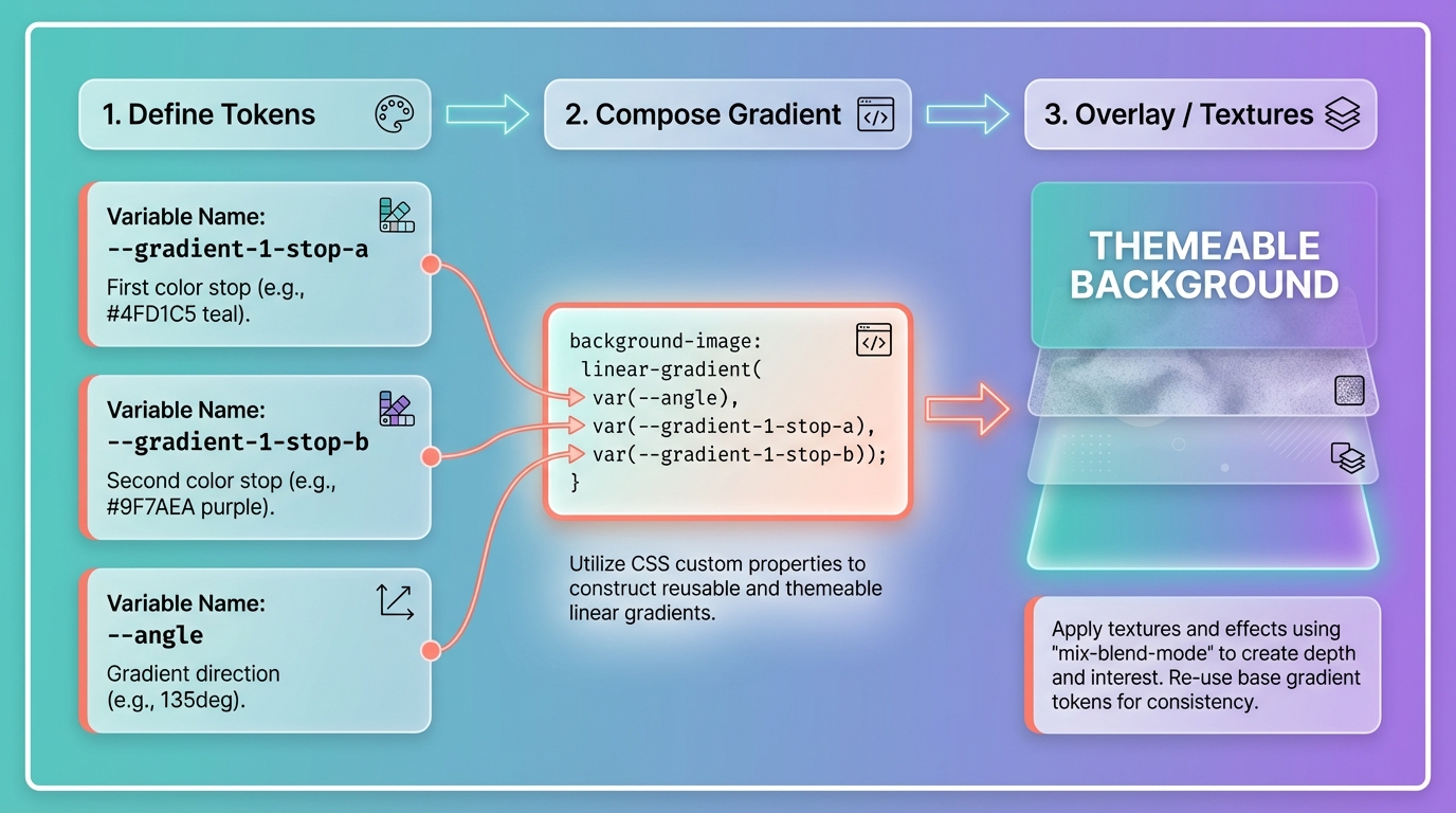
Adopt CSS variables for each color stop and tokenized gradient definitions so you can theme at scale. Example pattern: define --gradient-1-stop-a, --gradient-1-stop-b, then compose with background-image: linear-gradient(var(--angle), var(--stop-a), var(--stop-b)), plus overlay layers for textures. Layered gradients and mix-blend-mode let you reuse a base gradient while adjusting mood per component. Document these choices in your tokens and specs so designers and engineers reuse them consistently. For deeper guidance on documenting and scaling, see building a cohesive design system.
When to use SVG or image gradients and how to document fallbacks
Use CSS gradients for simple, responsive backgrounds and when you need runtime theming. Choose SVG or raster images when you require art-directed gradients, complex masks, or pixel-perfect compression. Always provide a solid-color fallback and explicit color tokens for older browsers and email clients. Version gradient tokens so rollbacks are traceable in release notes.
Accessibility and Performance Considerations
Ensuring legibility: contrast testing and color-blind safe palettes
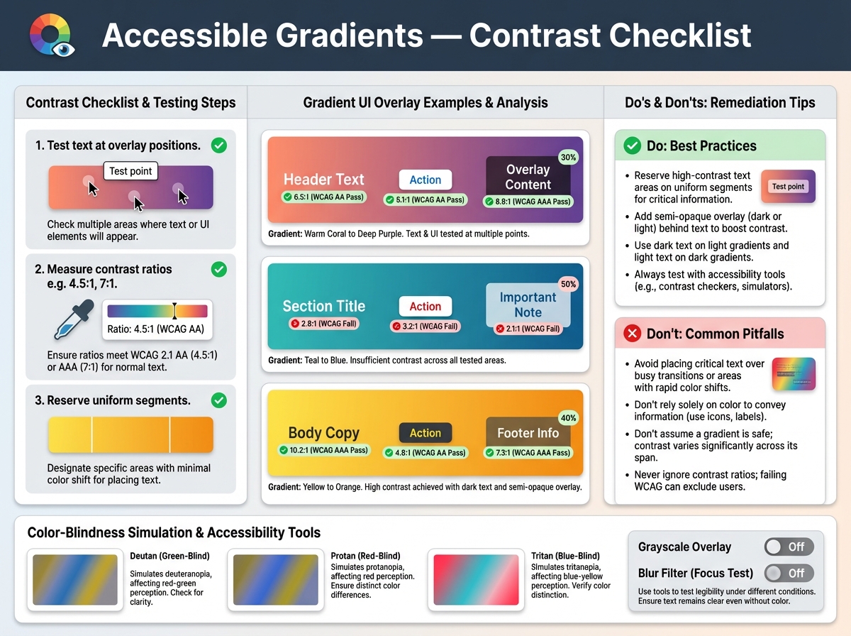
Accessible gradients are predictable gradients. Test text and UI components at their actual overlay positions with contrast checkers and simulation for common color-blindness types. Follow the practical checklist in why gradients fail WCAG — and how to fix them for specific remediation steps. Rules of thumb: reserve high-contrast text areas on uniform segments of the gradient, add semi-opaque overlays when necessary, and avoid placing small controls over high-frequency color transitions.
Rendering costs, animation limits, and measuring impact with Lighthouse
Animated gradients can force compositing and repaint overhead on mobile. Prefer transforms and opacity for motion. Measure impact with Lighthouse, CPU and paint times in DevTools, and real device testing. Mitigations include static fallbacks, reducing animation frequency, using will-change sparingly, and limiting animated gradients to large, non-scrolling surfaces.
Interaction, Motion, and Where Gradients Help Attention
Using micro-interactions and animated gradients without distraction
Use motion to create context, not to compete with content. Micro-interactions such as hover tint shifts or focused radial blooms guide attention to controls. Keep duration long and subtle, for example 6 to 12 seconds for loops, easing in and out. Honor prefers-reduced-motion by providing an immediate, static fallback.
Guidelines for timing, triggers, and reduced-motion users
Trigger gradients on meaningful events, not every hover, and avoid infinite high-frequency loops. Provide opt-out by respecting the reduced-motion media query in CSS or runtime settings.
From Prototype to Production: Testing and Design System Integration
A/B test hypotheses, KPIs, and test setup recommendations
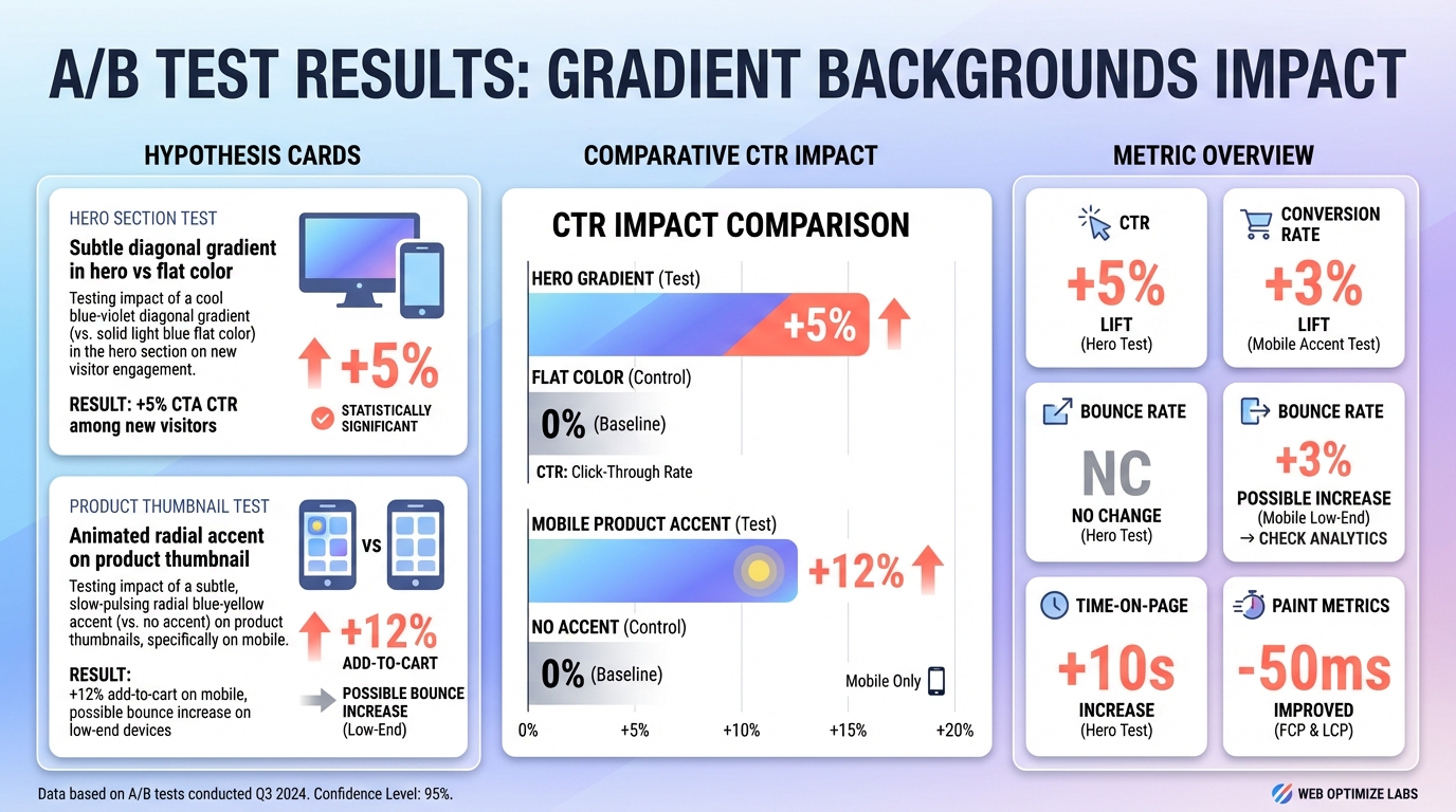
Example hypotheses: "Subtle diagonal gradient in hero versus flat color will increase CTA CTR by 5 percent among new visitors due to improved visual hierarchy." Or, "Animated radial accent on product thumbnail will increase add-to-cart rate for mobile users, but may raise bounce for low-end devices." Track CTR, conversion rate, bounce rate, time-on-page, and paint metrics. Run tests for at least two business cycles or 2 to 4 weeks, segment by device and network class, and ensure sufficient sample size for power.
Adding gradient tokens to your design system and versioning patterns
Add tokens for stops, angles, and motion profiles. Name tokens for intent, for example gradient-hero-cta or gradient-accent-muted. Version tokens when you change stop positions or motion curves so you can roll back safely and attribute experiment results.
Conclusion
Gradients are a strategic tool, not a default effect. Use them when they align with brand narrative, implement them with tokenized CSS patterns for maintainability, validate them with contrast and performance tests, and treat them as hypotheses in controlled experiments. When you follow these rules, gradient background design becomes repeatable, measurable, and defensible.


