Visual Design Playbook: Improve UX and Conversions on Your Site

High-impact visual changes you can implement this week
You can produce measurable gains on your site in days by focusing on a few high-leverage visual changes. These affect first impressions, scanning, and the clarity of the next action your users take. Below are prioritized interventions, short how-to steps, and example A/B tests you can run immediately.
Hero and above-the-fold improvements that increase clarity and conversions
Why it matters: the hero area decides whether a visitor stays, scrolls, or bounces. Small changes to messaging, image crop, and CTA prominence frequently move conversion by measurable amounts.
Quick wins, in order:
 Photo by Mitchell Luo on Unsplash
- Clarify the headline: single-sentence value prop, 8–12 words.
- Replace busy background images with a cleaned crop or subtle gradient so text reads easily.
- Increase CTA contrast and size, use primary color token.
- Reduce choice above the fold, keep 1 primary CTA, 1 secondary link.
- Add a 1-line supporting subhead that explains the outcome.
Example before/after scenario (hypothetical):
- Before: headline unclear, low-contrast CTA, hero image crowded. Metrics: bounce 62 percent, CTR to sign-up 1.8 percent.
- After: tightened headline, higher-contrast CTA, simplified hero image. Metrics after 2 weeks A/B test: bounce 49 percent, CTR to sign-up 2.8 percent, estimated conversion lift +55 percent.
A/B test setup for hero clarity:
- Variant A: control.
- Variant B: new headline + CTA color + simplified hero image.
- Primary metric: CTA click-through rate.
- Secondary metrics: bounce rate, time on page.
- Minimum sample: run until each variant has 1,500–3,000 visitors or use a power calculator (see A/B section below).
Callout: Quick wins
- Swap the hero background for a solid or subtle gradient if text contrast is poor.
- Use a short animation to reveal the CTA only if it makes the primary action clearer.
Related reading: using gradient backgrounds to tell a story shows how gradients move emotion and keep backgrounds from competing with copy.
Strengthening visual hierarchy with scale, spacing, and contrast
Visual hierarchy controls what your users notice first and how they scan. The right scale and spacing turn long pages into scannable journeys.
Concrete techniques
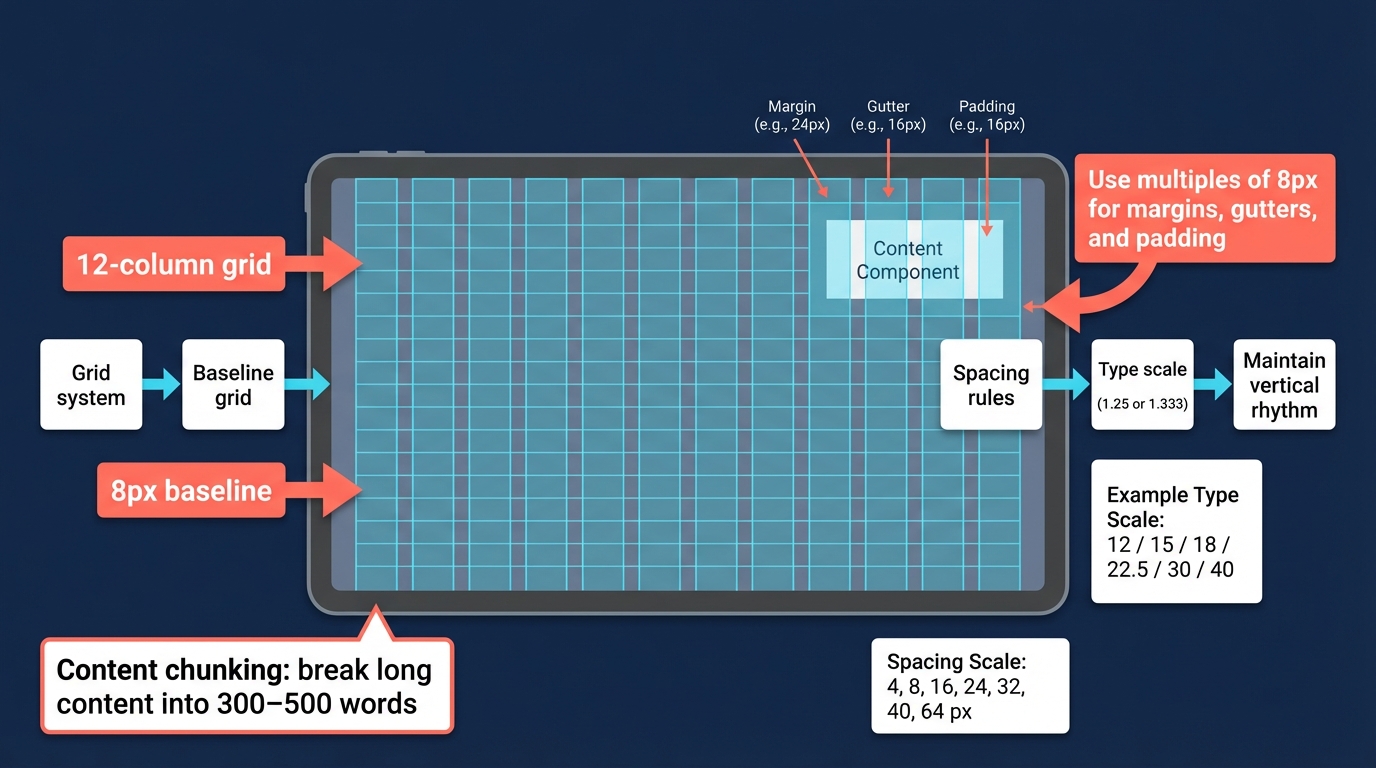
- Grid system and baseline: adopt a 12-column grid plus a baseline grid (8px modular scale). Use multiples of 8 for margins, gutters, and component padding.
- Scale ratios: use a type scale roughly following 1.25 or 1.333 ratios. Example scale: 12 / 15 / 18 / 22.5 / 30 / 40.
- Spacing scale: 4, 8, 16, 24, 32, 40, 64 px. Maintain consistent vertical rhythm.
- Content chunking: break long content into 300–500 word blocks with subheads, lists, and images.
- Scan patterns: F-pattern for text-dense pages, Z-pattern for simpler marketing pages. Use strong heading and CTA placement accordingly.
Rules of thumb
- Heading hierarchy: H1 visually 1.6–2x larger than body, H2 ~1.3–1.5x H1 section headings.
- Line length: ideal 50–75 characters per line for readability.
- Visual weight: primary CTA must be at least 2x more visually prominent than secondary actions.
Common pitfalls
- Using inconsistent padding across components causes perceived sloppiness.
- Relying solely on color to indicate hierarchy without adjusting size or weight reduces accessibility.
Practical checklist to improve hierarchy in one pass:
- Establish baseline grid and spacing scale.
- Audit top 10 landing pages for heading sizes and line length.
- Ensure primary CTA is largest interactive element above the fold.
- Remove competing CTAs in hero and key sections.
- Update image crops to frame subject toward the content flow.
Quick CTA fixes: copy, color, and placement that lift response
Small CTA changes are some of the quickest to test and measure.
3-step CTA optimization you can do in a day:
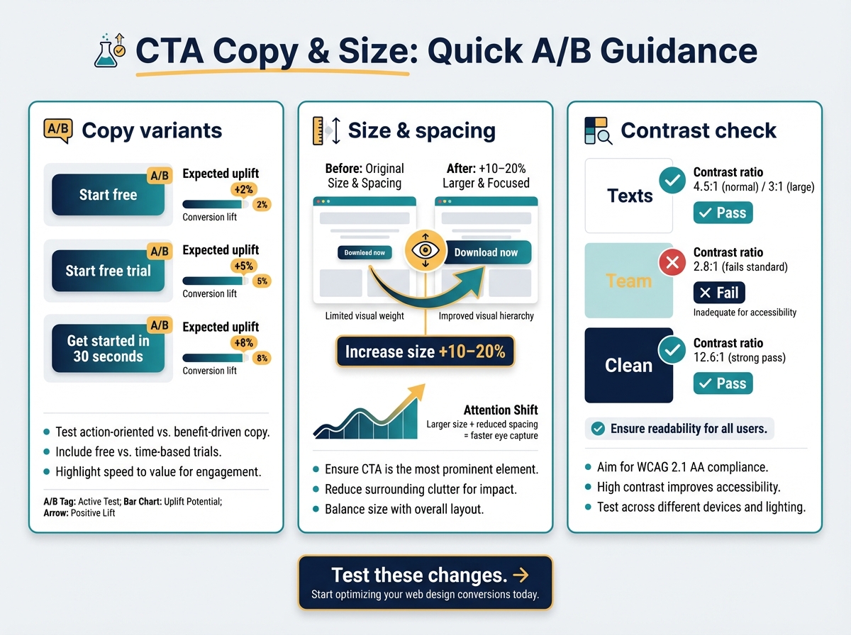
- Test copy variants: "Start free" vs "Start free trial" vs "Get started in 30 seconds".
- Increase size by 10–20 percent and reduce surrounding whitespace to make it anchor the eye.
- Ensure contrast ratio of CTA text/background is at least 4.5:1 for normal text or 3:1 for large text.
A/B test template: CTA color swap
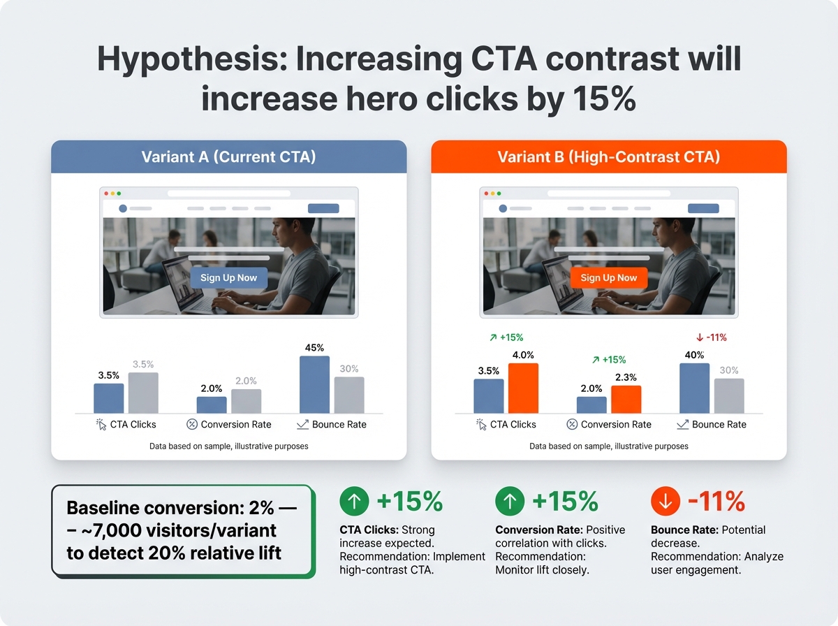
- Hypothesis: Increasing CTA contrast will increase clicks on the hero by 15 percent.
- Variant A: current CTA.
- Variant B: CTA changed to high-contrast primary token, copy unchanged.
- Metrics: CTA clicks, conversion rate, bounce rate.
- Estimate sample: For baseline conversion 2 percent, to detect a 20 percent relative lift you need ~7,000 visitors per variant. Smaller sites can run longer and combine with sequential testing.
Tools to run quick CTA tests: VWO, Optimizely, or simple server-side split tests in your CMS.
Related quick asset: try the free mesh gradient generator for backgrounds to create subtle hero backgrounds that support CTA readability.
Create a color and component system that keeps your website consistent
Scaling visuals without design debt requires tokens, clear documentation, and a small set of components that content creators can reuse without custom styling each time.
Build a token-based color system and map states to function
How to start in 2 hours:
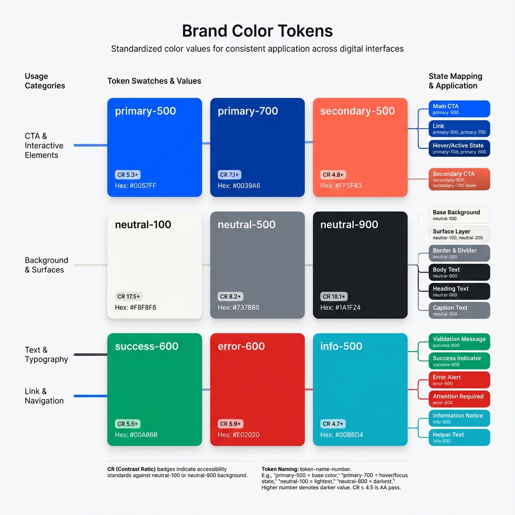
- Capture brand colors: primary, secondary, supportive neutrals.
- Generate functional tokens: primary-500, primary-700, neutral-100, neutral-900, etc.
- Define state mapping: primary for main CTAs, secondary for links, success for confirmations, error for validation, info for attention but not critical.
Example token map:
- primary-500: CTA background
- primary-700: CTA hover
- neutral-100 / neutral-900: page background / text
- success-500: success states
- error-500: error states
- focus-contrast: color for focus outlines that meets accessibility
Contrast checklist for tokens:
- Text on primary-500 has contrast >= 4.5:1 for body size.
- Disabled state colors keep sufficient contrast ratio for readability.
- Focus states use visible outlines and at least 3:1 contrast to surrounding content.
Pattern mapping to states:
- Primary: action emphasis
- Secondary: tertiary actions and links
- Surface: cards and panels
- Border: separators
- Feedback: success, warning, error
Avoid decorative misuse: reserve the most saturated brand color for actions, not background fills on long content areas.
Naming, documentation, and versioning for reusable components
Documentation first, code second. Name tokens by purpose, not color names. Example: use token names like token-cta-bg rather than "ocean-blue".
Minimum docs for each component:
- Purpose and when to use it.
- Anatomy (icon, label, spacing).
- Props and states with screenshots.
- Accessibility notes (keyboard, aria labels).
- Code snippets or CMS block settings.
Versioning approach:
- Semantic versioning for component library (v1.2.0).
- Change log with migration notes for content creators.
- Release cadence: small changes weekly, breaking changes quarterly with migration window.
Related resource: When you are ready to scale visual changes across pages and teams, use inspiration and system patterns in "build a cohesive design system" to convert quick wins into company-wide consistency.
Responsive rules: how components adapt across breakpoints
Responsive rules to enforce:
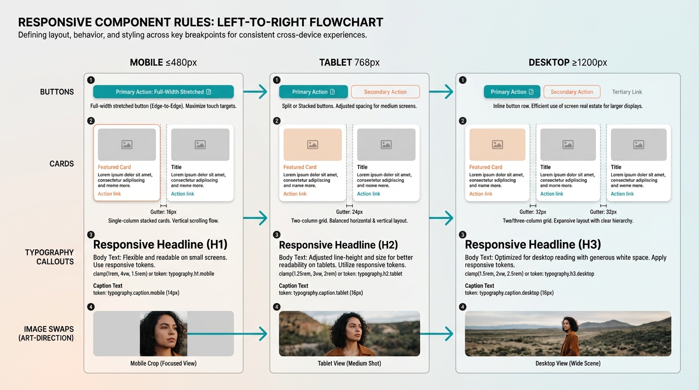
- Buttons: full-width on small screens, inline on desktop.
- Cards: single column to two/three columns with consistent gutter scale.
- Typography: adjust type scale at breakpoints using clamp or responsive tokens.
- Images: use art direction, swap crops between mobile and desktop.
Practical responsive spec example:
- H1 sizes: mobile 28px, tablet 36px, desktop 44px.
- Container max-widths: mobile 100 percent, tablet 740px, desktop 1100px.
- Spacing: base 16px mobile, 24px tablet and above.
Typography, imagery, and motion: details that shape user experience
Small, deliberate changes in type, image handling, and motion reduce friction and increase trust.
Practical type scales, line lengths, and pairing for readability
Type decisions that affect engagement:
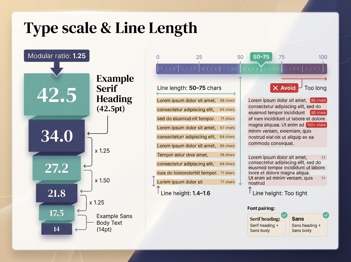
- Type scale: choose a modular ratio and stick to it. Example scale (1.25): 14, 17.5, 21.8, 27.2, 34.0, 42.5.
- Line length: aim for 50–75 characters per line for body copy.
- Line height: 1.4–1.6 for body text depending on size.
- Font pairing: use a single serif or display for headings + a legible sans for body. Limit to 2–3 typefaces total.
Microcopy that improves scanning:
- Use action-focused CTAs: "Download PDF" vs "Learn More".
- Add benefit fragments under CTA: "No credit card required".
- Place microcopy under forms to reduce anxiety about data usage.
Checklist for responsive type:
- Set fluid type with clamp where feasible.
- Verify headings maintain hierarchy across breakpoints.
- Test on real devices for legibility, not just browser zoom.
Strategic use of photography, illustration, and icons
Choose the right visual style for your content goals:
- Photography for authenticity and trust, ideal for case studies, team pages.
- Illustration for abstract concepts, explainer sections, and to control focus.
- Icons for quick scanning, use a consistent stroke width and grid.
Image selection and cropping
- Crop to the focal point and align composition with reading flow.
- Use 16:9 for wide hero images, 4:3 or square for content images.
- Avoid heavy background detail behind text; use gradients or overlays where needed.
Image optimization steps
- Export at correct size for common breakpoints.
- Use modern formats: WebP and AVIF where supported.
- Apply compression while checking for artifacts.
- Serve responsive srcsets with 1x/2x or width descriptors.
Icon system rules
- Build a 24px baseline grid for icons.
- Use consistent corner radii and stroke width.
- Provide semantic names and states: icon-check, icon-warning, icon-search.
Tools: use Figma for layout and export specs, Squoosh or ImageOptim for compression, and Cloudinary or imgix for dynamic delivery.
Common pitfalls
- Overusing large photos on content pages increases load time.
- Mixing photo styles and illustration styles without rules breaks cohesion.
Micro-interactions and motion patterns that communicate state
Motion can either clarify or distract. Use it to show change of state, progress, and affordance.
Patterns to use
- Loading skeletons: show approximate content shape when data loads.
- Hover and press feedback: 50–100 ms for hover lift, 40–80 ms for press down.
- Progressive disclosure: animate height/opacity when revealing details.
- Form validation: subtle color and shake for error, quick success check for confirmation.
Motion timings and easing
- Micro-interactions: 100–200 ms for transitions that confirm an action.
- Medium transitions: 250–400 ms for revealing content.
- Easing: use cubic-bezier(0.2, 0.8, 0.2, 1) or standard ease-out curves for natural motion.
Accessibility considerations
- Respect prefers-reduced-motion: provide non-animated fallbacks and instant state changes.
- Keep motion small in amplitude for users sensitive to movement.
Micro-interaction checklist:
- All interactive elements have hover/press states.
- Loading states are informative and reduce perceived wait.
- Reduced-motion preference is supported.
Accessibility, performance, and measuring the impact of visual work
Balancing visual polish with accessibility and speed is essential: improvements that look good but slow the page or exclude users will hurt conversion in the long run.
Accessibility checklist for visuals (contrast, focus, motion)
Practical accessibility checklist:
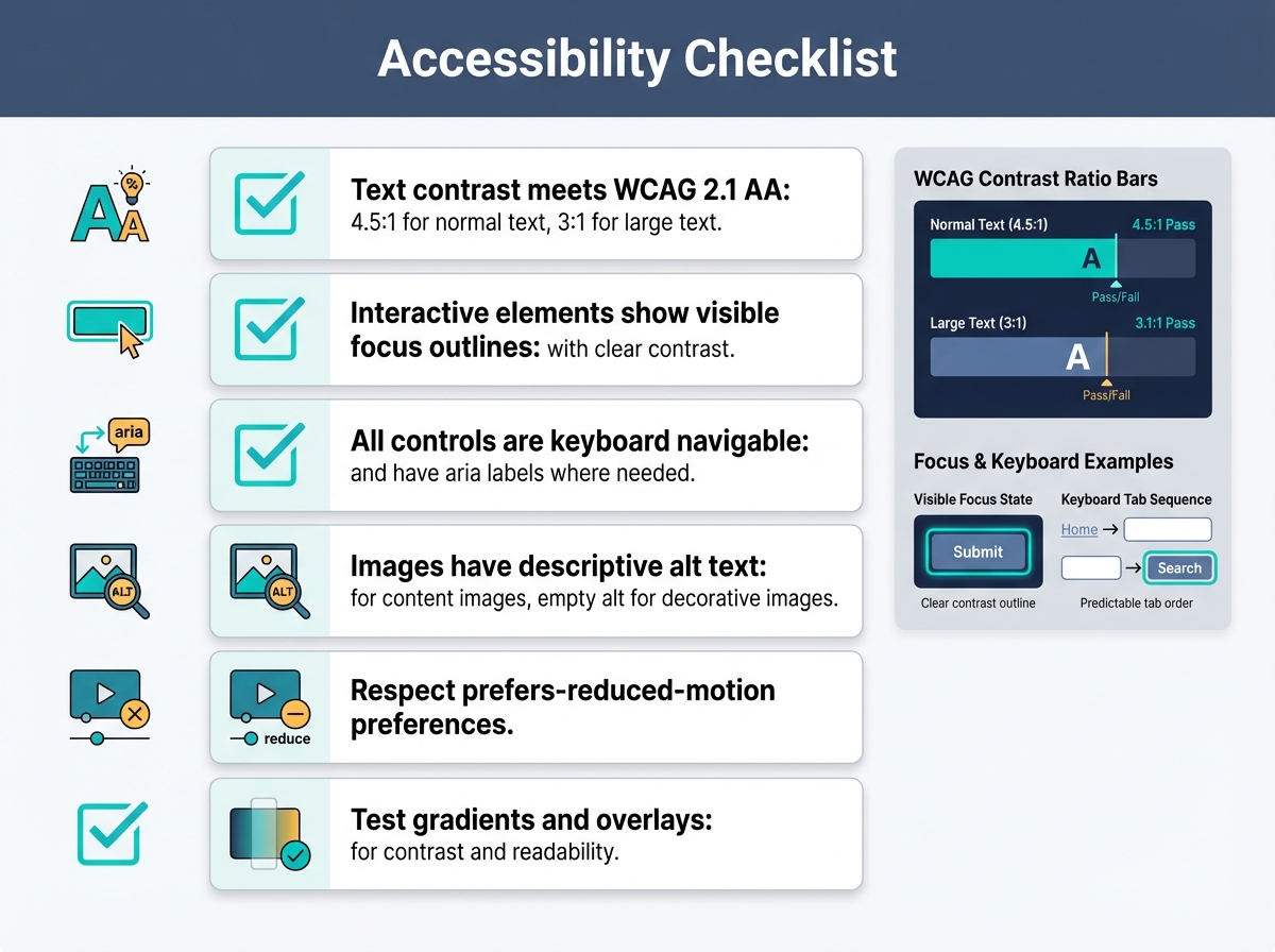
- Text contrast meets WCAG 2.1 AA: 4.5:1 for normal text, 3:1 for large text.
- Interactive elements show visible focus outlines with clear contrast.
- All controls are keyboard navigable and have aria labels where needed.
- Images have descriptive alt text for content images, empty alt for decorative images.
- Respect prefers-reduced-motion preferences.
- Test gradients and overlays for readability, see the accessible gradients (WCAG guide) for fixes.
Callout: Accessibility as design Choosing accessible colors and focus states often improves clarity for everyone. For example, higher contrast makes headings pop and reduces cognitive load, which can increase time on page and conversions.
Performance tradeoffs: image formats, lazy loading, and visual stability
Performance decisions that preserve visual quality:
- Use responsive images with srcset and sizes attributes.
- Prefer AVIF/WebP for photos with fallback to JPEG/PNG.
- Lazy load offscreen images but eagerly load hero images.
- Inline critical CSS for above-the-fold styles to reduce render delay.
- Avoid heavy layout shifts: reserve image dimensions to lower CLS.
Performance budget suggestions tied to visuals
- Total page weight target: 500–800 KB for content pages, 1.5 MB for heavy landing pages.
- Largest Contentful Paint target: under 2.5 seconds on mobile 3G emulation.
- Cumulative Layout Shift target: under 0.1.
Tools to measure and debug: Lighthouse, WebPageTest, Chrome DevTools, and real-user monitoring via Google Analytics or RUM tools.
A/B testing, metrics to track, and an iterative workflow for design improvements
Metrics to track for visual work:
- Engagement: time on page, scroll depth, interactive events.
- Conversion: CTA clicks, form completions, sign-ups.
- Task success: completion rates for workflows (checkout, form).
- Performance: LCP, CLS, FID or INP.
- Accessibility: keyboard task completion rates, screen reader issues from user testing.
Top 5 prioritized playbook for most content sites, order to run them
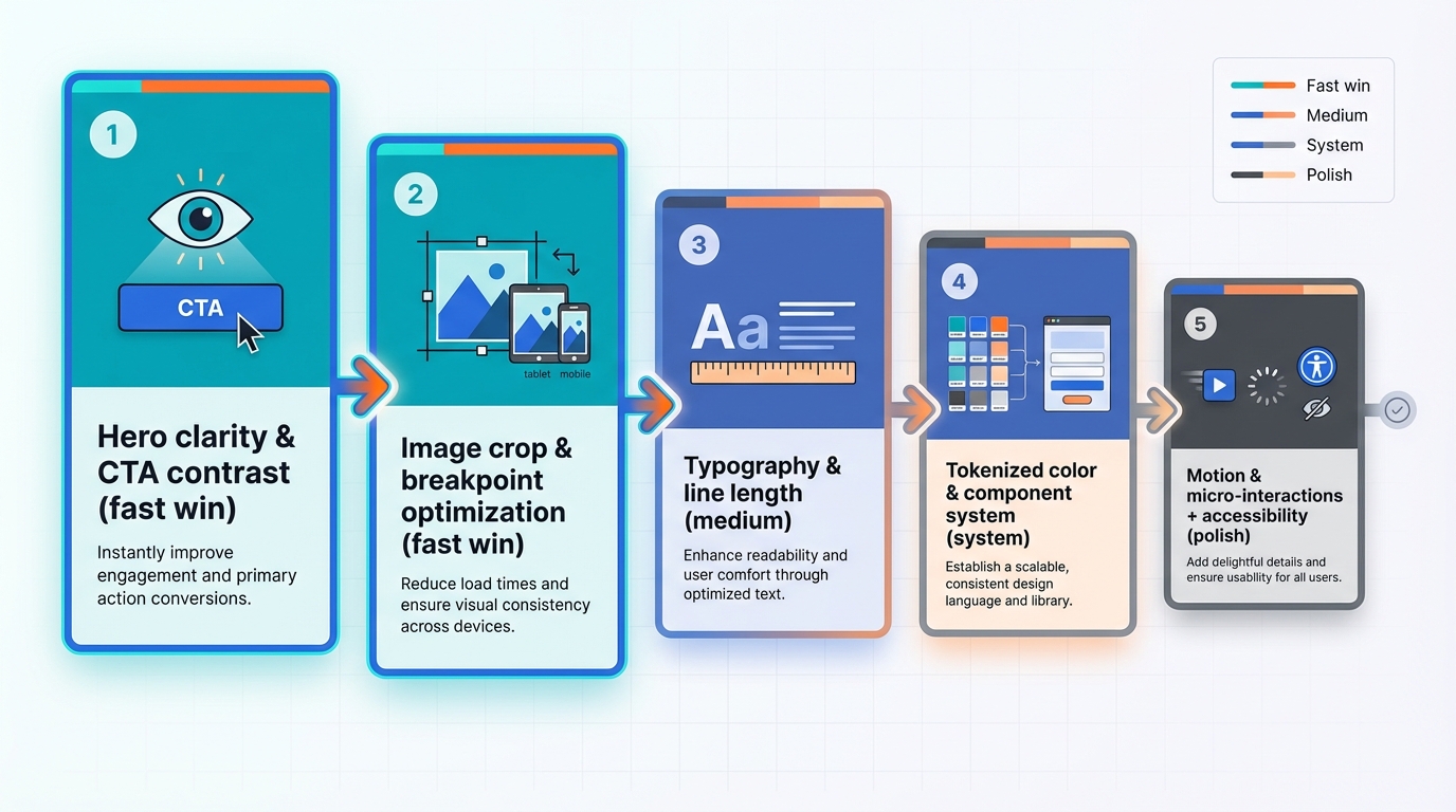
- Hero clarity and CTA contrast (fast win).
- Image crop and optimization across breakpoints (fast win).
- Typography and line length corrections sitewide (medium).
- Tokenized color and component system for consistency (system work).
- Motion and micro-interactions with accessibility fallbacks (polish).
Case-style example: Hypothesis to result
- Hypothesis: Simplifying the hero and increasing CTA contrast will lift sign-ups.
- Baseline: Home page traffic 30,000 visits/month, signup rate 1.6 percent.
- Intervention steps:
- Rewrite headline to concise value prop.
- Replace hero image with art-directed crop and subtle gradient.
- Increase CTA size and swap to primary token color.
- Implement A/B test with equal traffic split.
- Metrics tracked: CTA CTR, signup rate, bounce rate, LCP.
- Outcome after 4 weeks (example realistic numbers): CTA CTR +42 percent, signup rate +28 percent, bounce rate -11 percent, LCP improved by 0.6s due to optimized hero image.
- Interpretation: The combined visual and performance fixes clarified action and reduced friction, yielding a sizable lift in conversions.
A/B test templates (three you can copy)
- Headline + CTA test
- Hypothesis: concise headline and stronger CTA will increase signups.
- Variant B changes headline, CTA color and size only.
- Metrics: signup rate, CTR, bounce.
- Image vs illustration
- Hypothesis: illustration will increase engagement for an abstract product.
- Variant B swaps hero photo for illustration.
- Metrics: time on page, scroll depth, signup rate.
- Typeface and line length
- Hypothesis: adjusted line length and type scale will increase reading completion on blog posts.
- Variant B reduces max-width and increases line height.
- Metrics: time on page, scroll depth, bounce.
Sample size guidance
- Big lifts (20 percent or more relative) require fewer visitors, for example 2,000 per variant.
- Small lifts (5–10 percent) need more: 5,000–20,000 per variant depending on baseline conversion.
- When in doubt, run tests longer and monitor for stability.
Lightweight retrospective for design debt
- Run weekly 15-minute review of visual changes and results.
- Log regressions or new inconsistencies.
- Prioritize fixes into quick, medium, system buckets.
- Assign owners and set a small release cadence.
Workflow for content creators to collaborate with designers without heavy handoffs
- Image specs: provide crop ratios, focal points, and file size targets in a shared brief.
- Component selection: creators choose from a pre-approved component library in the CMS.
- Microcopy templates: supply CTA and meta templates for common page types.
- Rapid review: use comments in Figma or a single Slack channel for design approvals with screenshot annotations.
Tools and resources that speed iteration
- Design and prototyping: Figma, Storybook for component preview.
- Image processing and delivery: Cloudinary, imgix, Squoosh.
- Performance and accessibility: Lighthouse, AXE browser extension.
- Testing and analytics: VWO, Hotjar for qualitative insights, GA4 for behavior.
Conclusion

Improving the visual design of your site is both tactical and systemic. Start with high-impact, measurable changes: hero clarity, CTA contrast, image optimization, and consistent spacing. Use tokenized color and component systems to keep those wins from decaying as your site grows. Tune typography, image treatment, and motion to guide attention without excluding or slowing your users. Measure everything with clear metrics, run pragmatic A/B tests, and keep a lightweight workflow so content creators can ship polished pages without heavy developer handoffs.
Common pitfalls to avoid: inconsistent spacing, ignoring accessibility, and piling on decorative visual effects that slow pages. Quick wins you can try today: tighten your hero headline, increase CTA contrast, crop and optimize your hero image, and implement a skeleton loader for slow sections.
If you want design inspiration and system-level patterns for scaling these changes, check out the Instant Gradient post on how to build a cohesive design system. For gradient-specific accessibility fixes check the accessible gradients (WCAG guide). To experiment quickly with subtle background treatments that support headline legibility, try resources for using gradient backgrounds to tell a story and the free mesh gradient generator for backgrounds.
Start with the five prioritized changes listed above, measure impact, and convert successful patterns into tokens and components. That way your visual improvements become reliable lifts for user experience and conversions, not one-off experiments.


